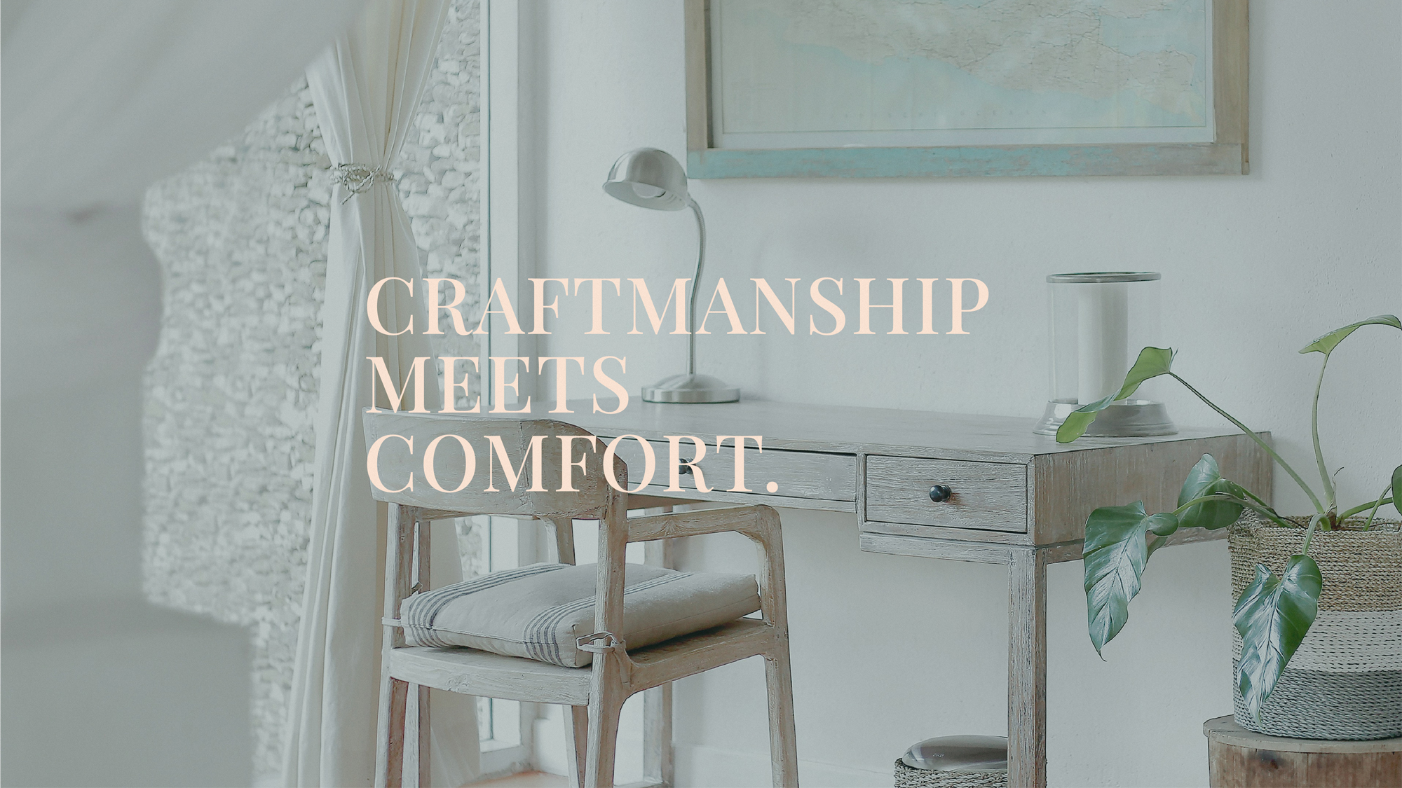
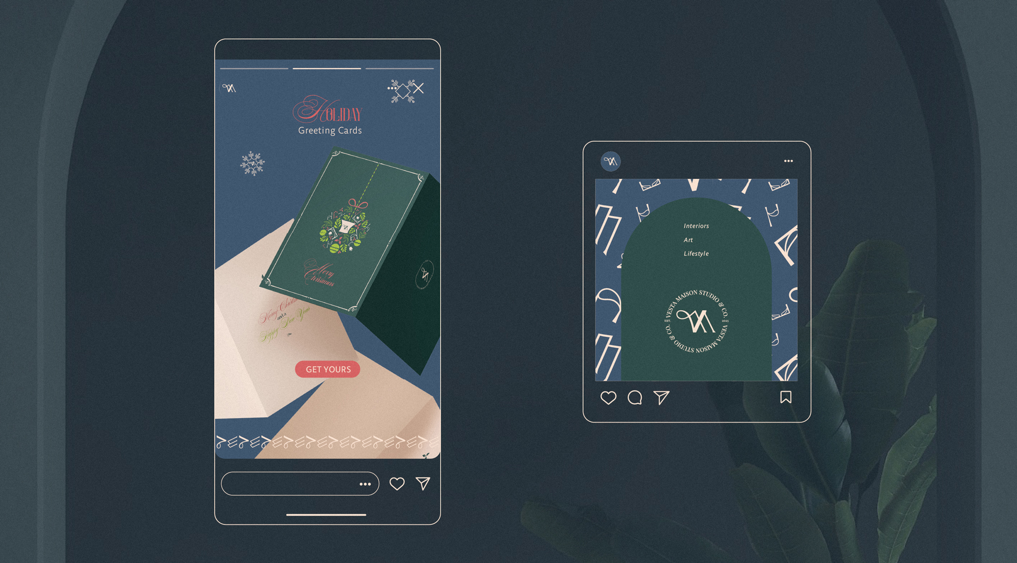
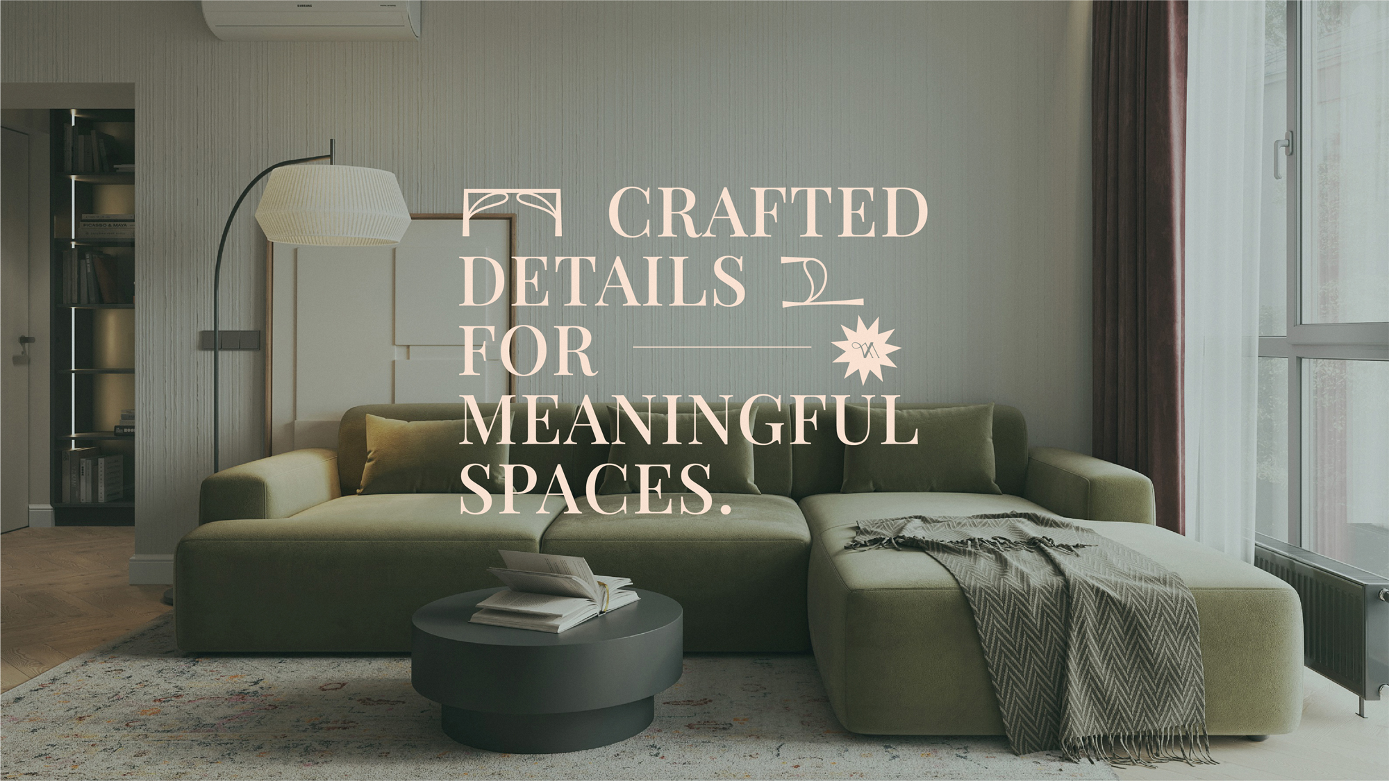
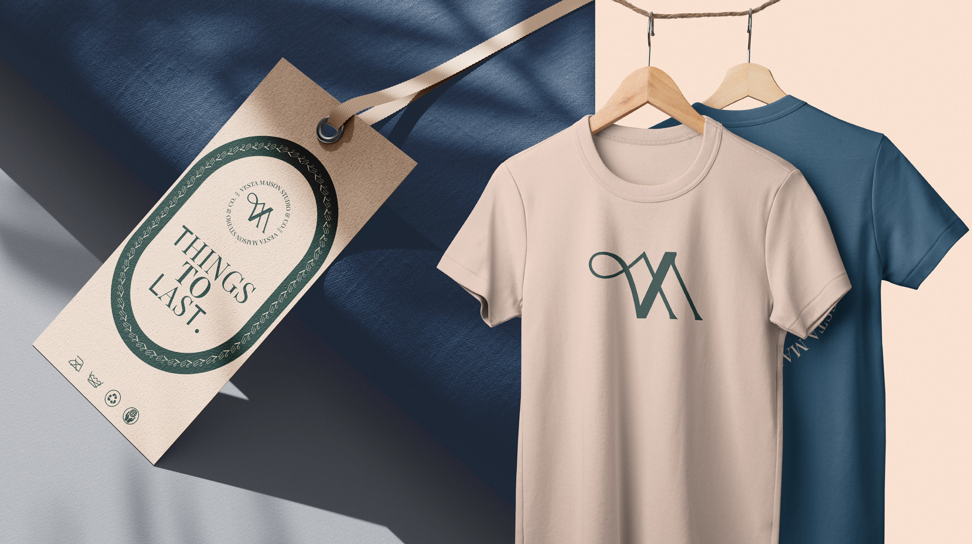
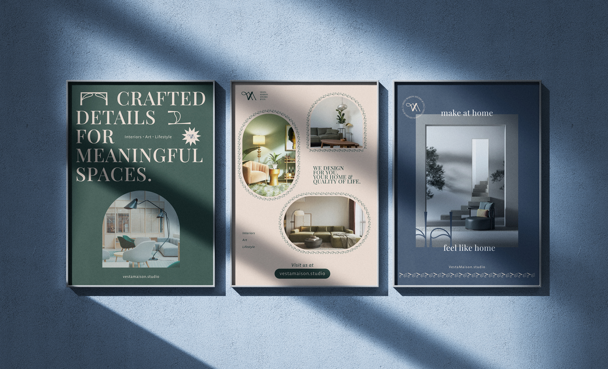
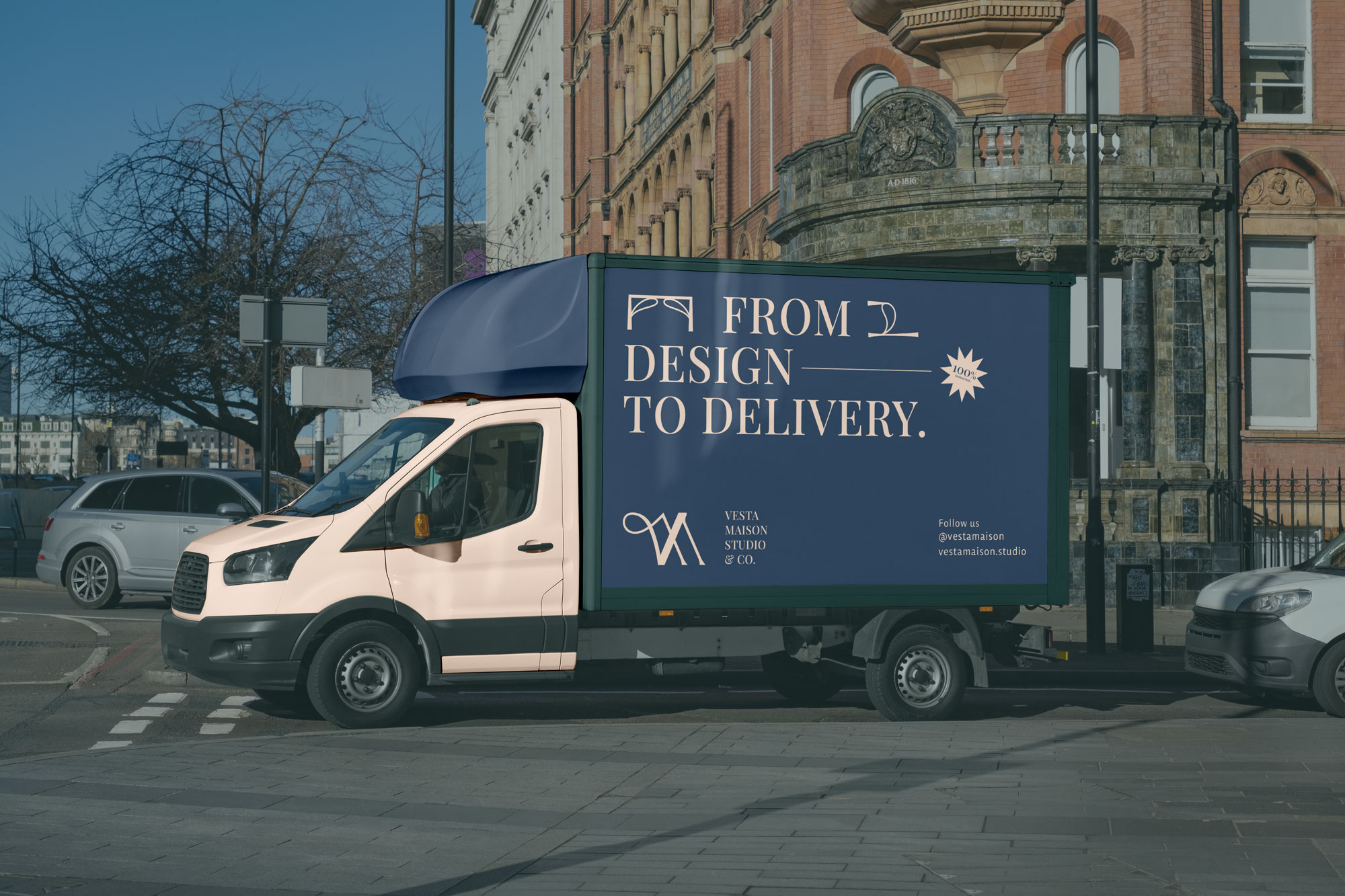
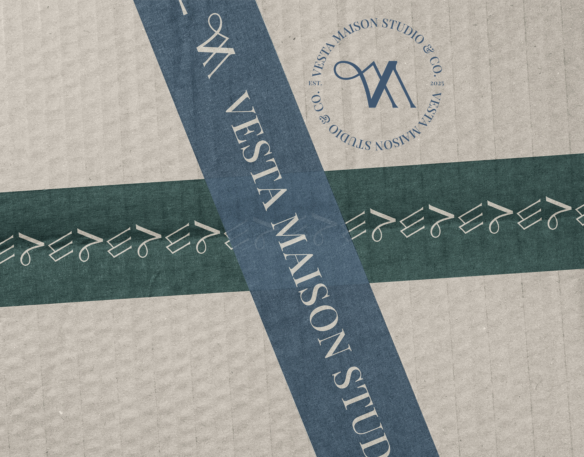
Vesta Maison is inspired by modern and early 20th-century aesthetics, blending a quiet, homely sensibility with subtle nostalgia. The brand embraces an ambient, grounded visual language (off vibrant, but warm, comforting, and emotionally resonant). Its mission is to distill comfort through design, artfully merging timeless interior and furniture influences with modern technology and contemporary living. Vesta Maison seeks balance and harmony within fast-changing lifestyles, creating spaces and objects that feel both stylish and deeply integrated into everyday life—rooted in craftsmanship, meaningful design, and quiet beauty.
Many interior and lifestyle brands lean either too modern and sterile or too vintage and dated. The challenge was to balance warmth and tradition with clarity and modern functionality (without overwhelming the audience or losing authenticity).
To create a cohesive brand identity for an interior design and lifestyle studio that blends nostalgic craftsmanship with modern living. The brand needed to feel calm, refined, and timeless while remaining relevant to contemporary lifestyles and products.
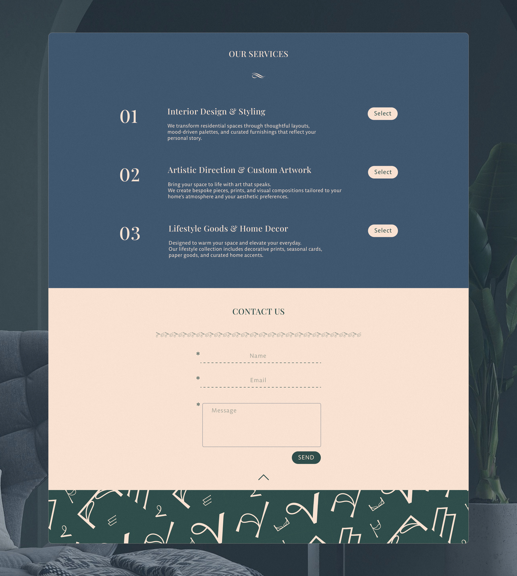
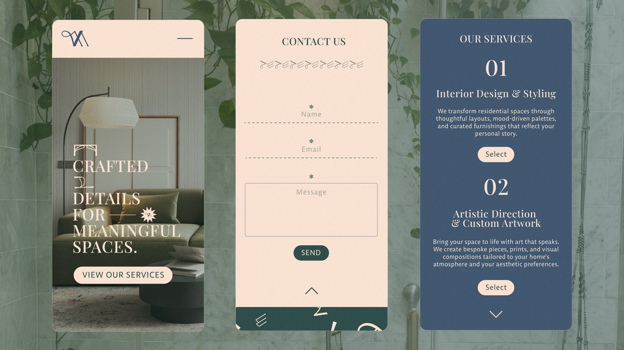
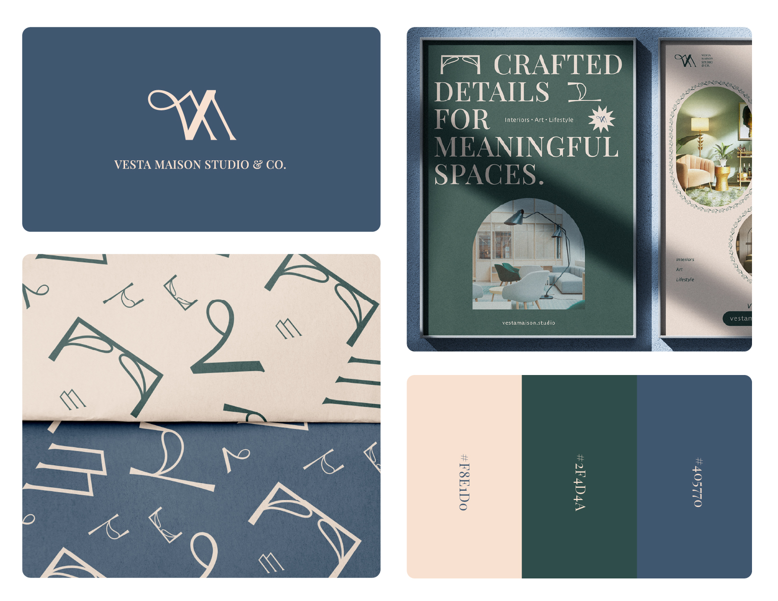
A thoughtfully designed visual system combining muted, nature-inspired colours, a refined typographic hierarchy, and a monogram logo that bridges two design eras. The result is a versatile identity that feels grounded, ambient, and adaptable across interiors, printed materials, and lifestyle products.
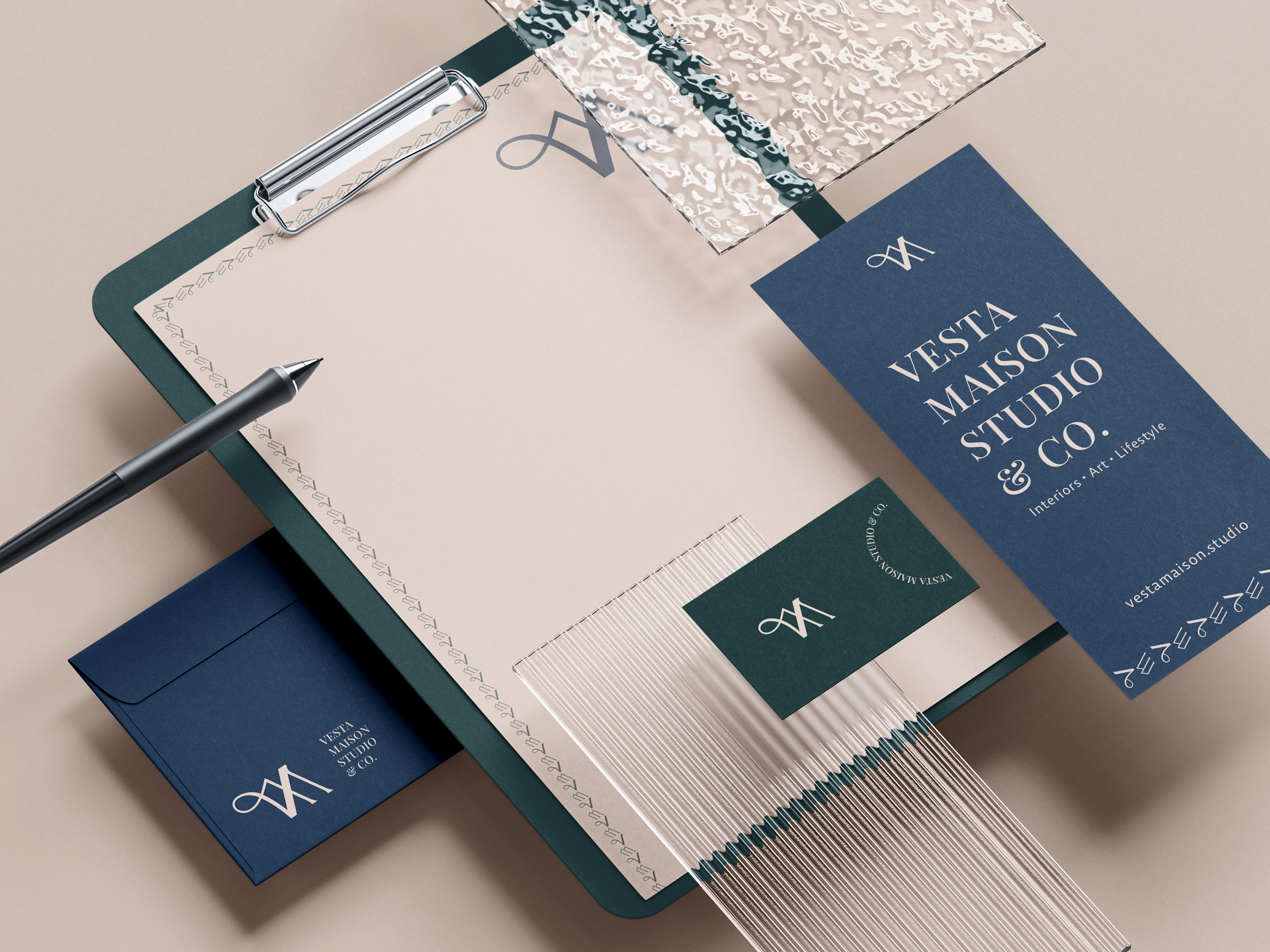
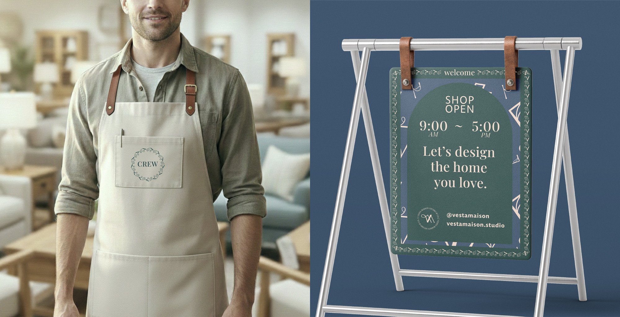
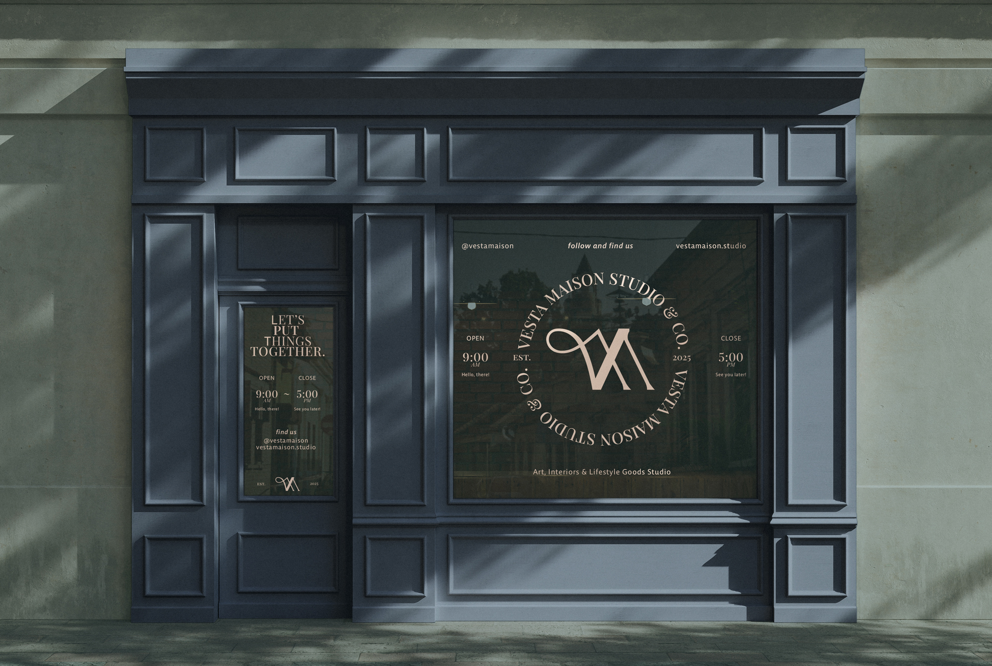
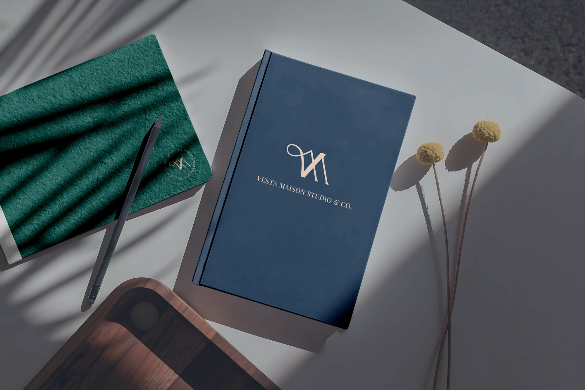
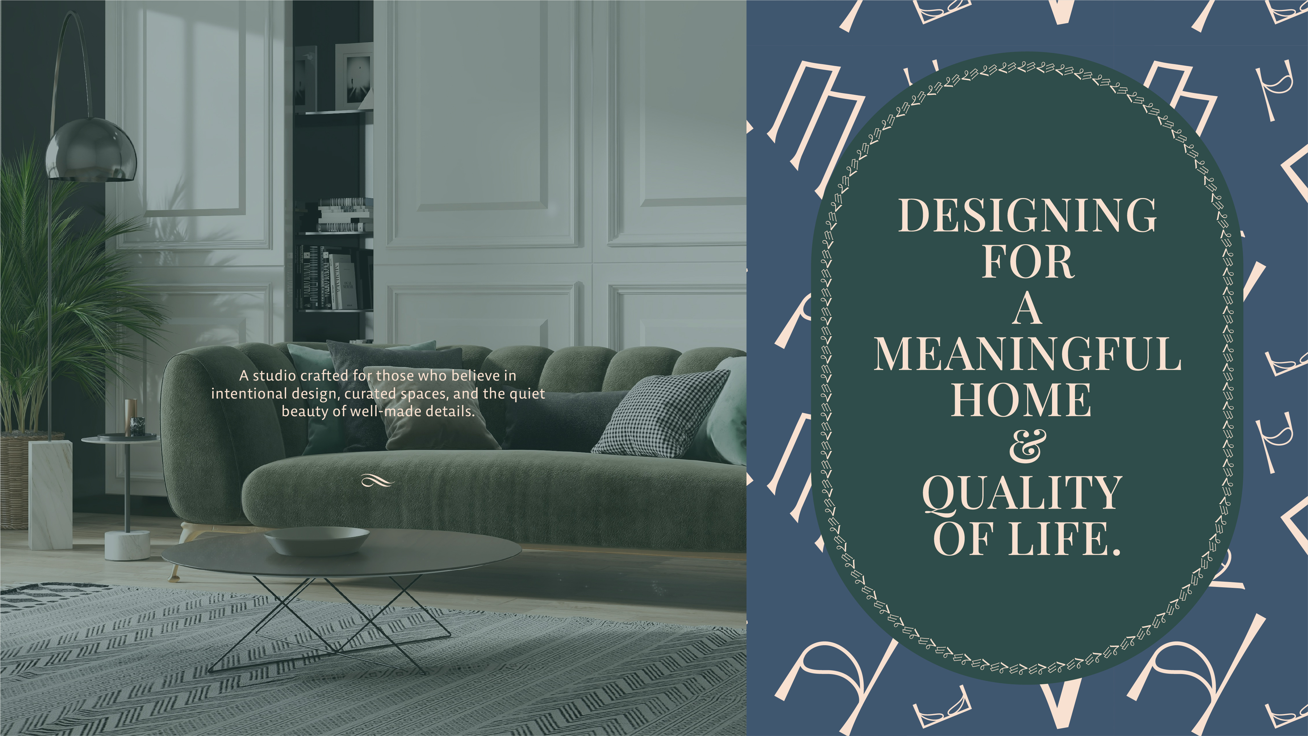
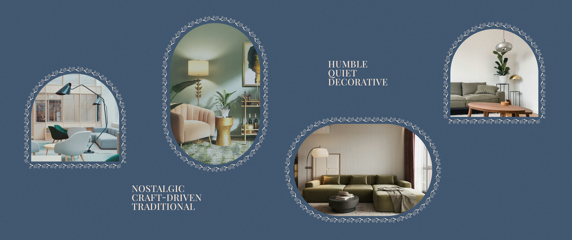
The overall visual draws from nature and dimly lit interiors, evoking calm and intimacy. Muted green tones connect modern appliances with organic elements, while French navy introduces depth and ambience. Vintage beige balances sunlit warmth with a traditional, nostalgic undertone. Creating a palette that feels timeless, grounded, and reflective of lived-in spaces. The logo is inspired by furniture and interior structures, featuring a non-conforming monogram echoing the rhythm of window blinds and architectural details with complementary ornamental patterns adding a decorative, vintage accent across brand collaterals
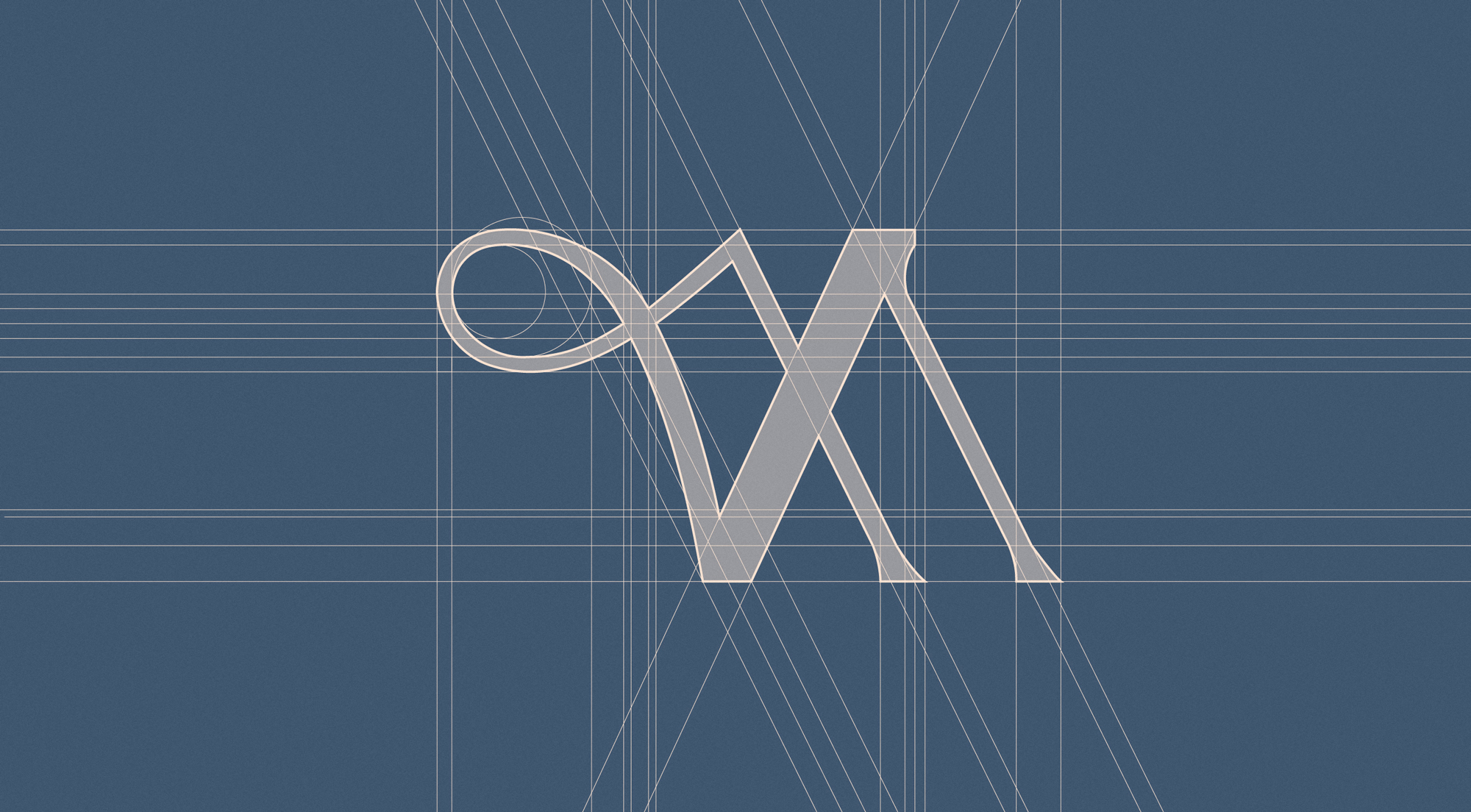
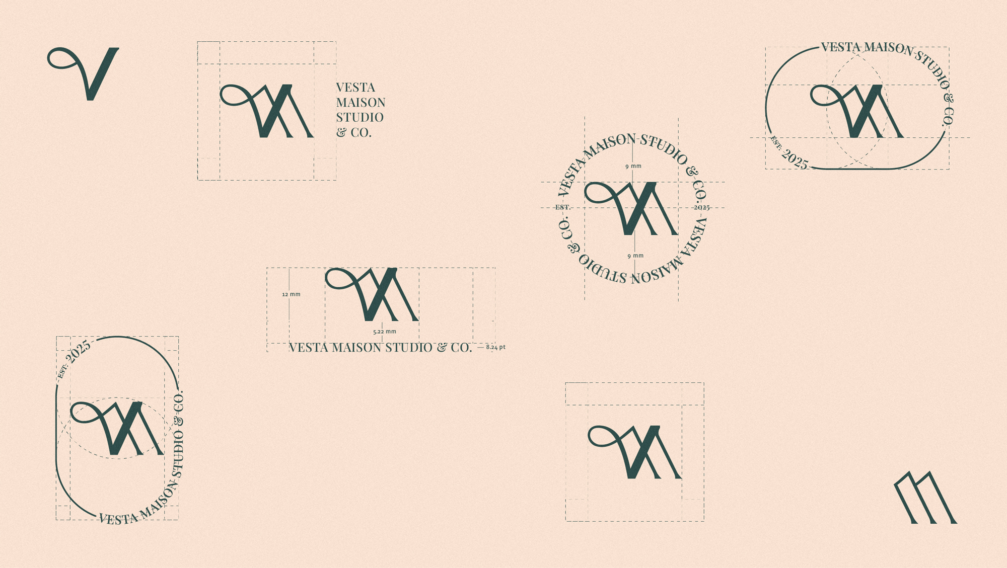
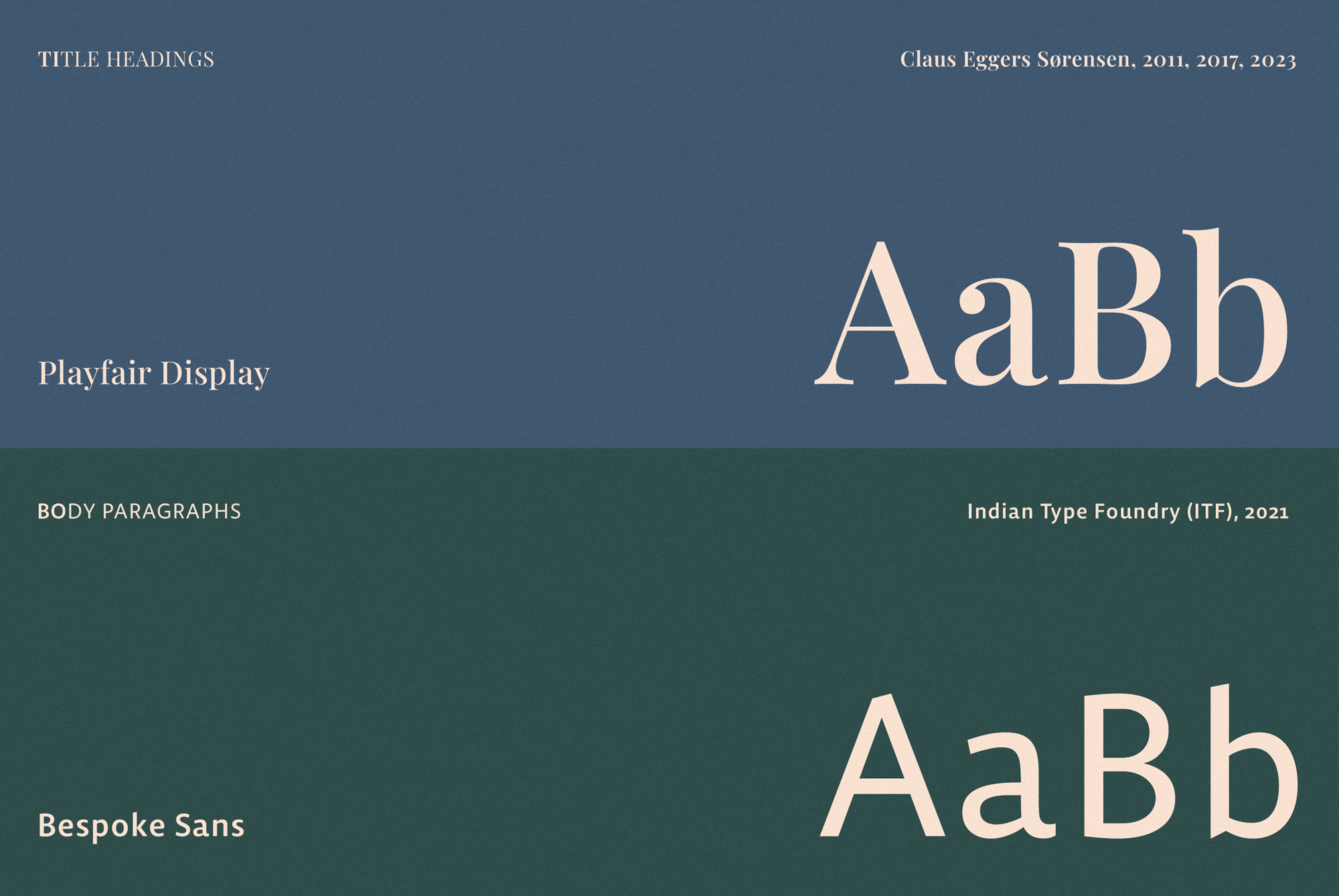


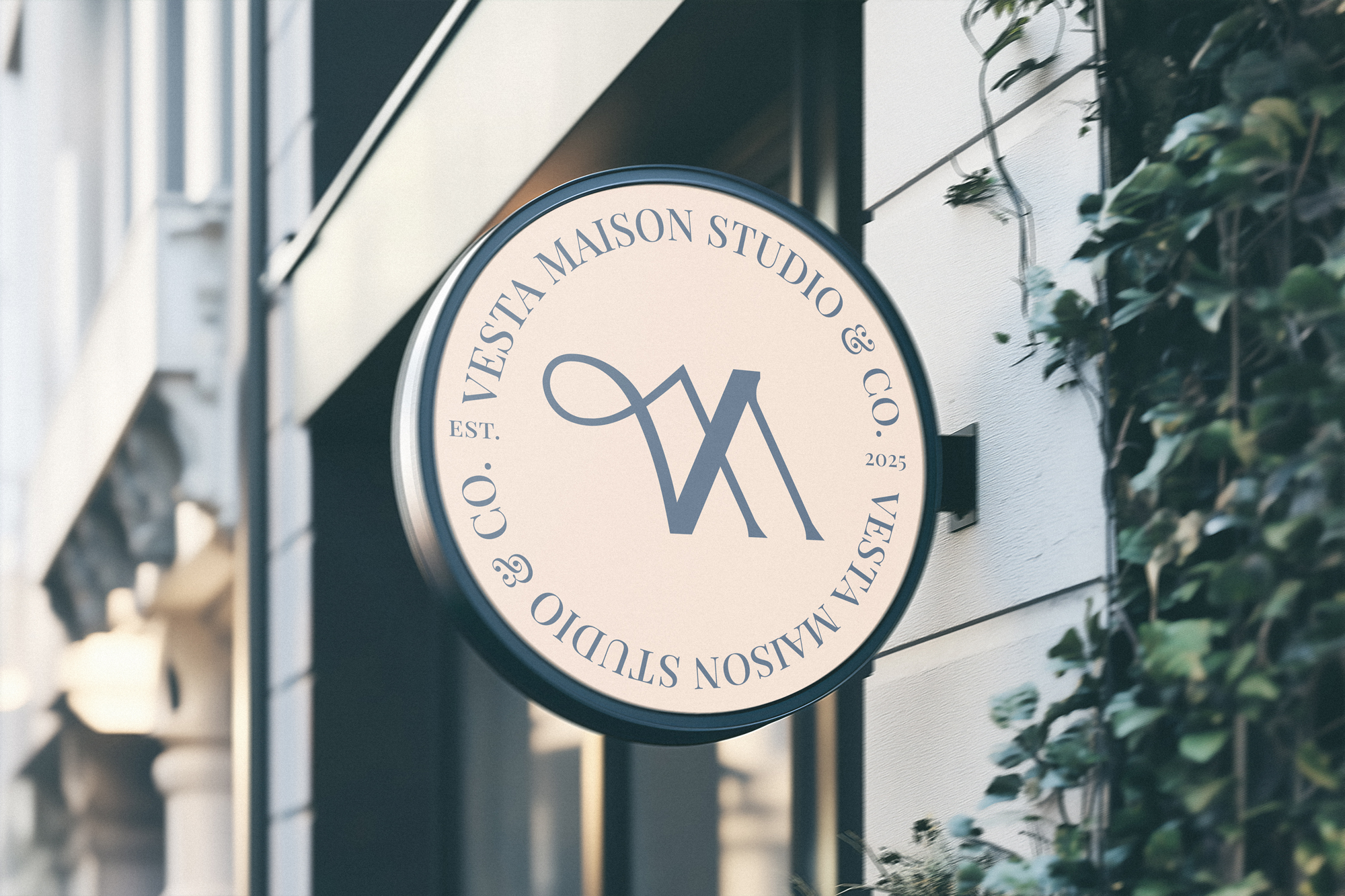
“V” is rendered as a stylized serif form inspired by early industrial, Art Deco, and furniture design traditions, while the “M” appears as a combined sans-serif italic form representing modernity and abstraction. Together, they express harmony between two eras reflecting the past and present philosophical tone. The logo system includes multiple submarks, such as a traditional circular emblem placing the monogram at the center, surrounded by the brand name in serif type and the established year in sans serif highlighting the dialogue between the two typefaces and their visual balance. As well as symbolic submarks inspired by chairs and tables to further reinforce the interior-focused tone.
