The PATH is Toronto’s underground pedestrian network, one of the largest of its kind in the world. With thousands of daily commuters, tourists, and workers relying on its routes, its existing wayfinding system posed major navigation challenges. This project reimagines PATH’s wayfinding experience with a clear, intuitive, and accessible system designed to guide travelers seamlessly through the network.
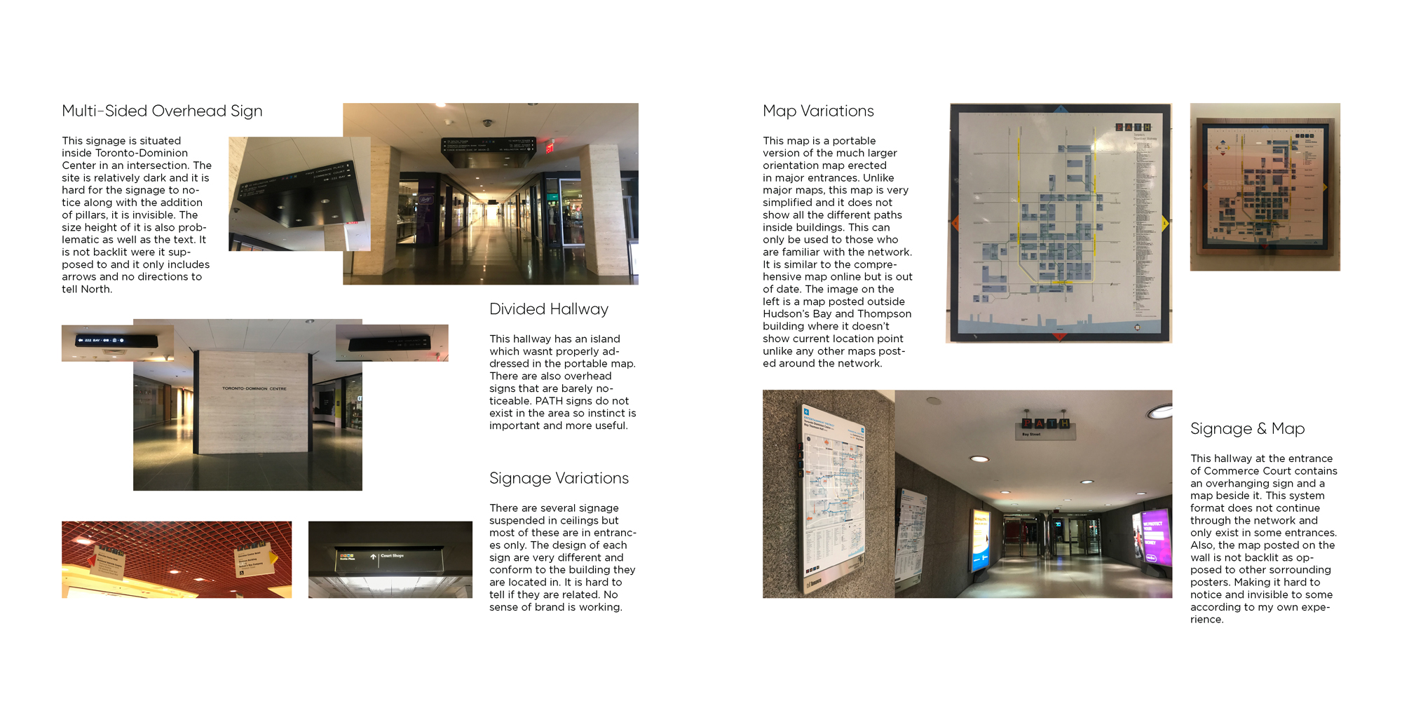
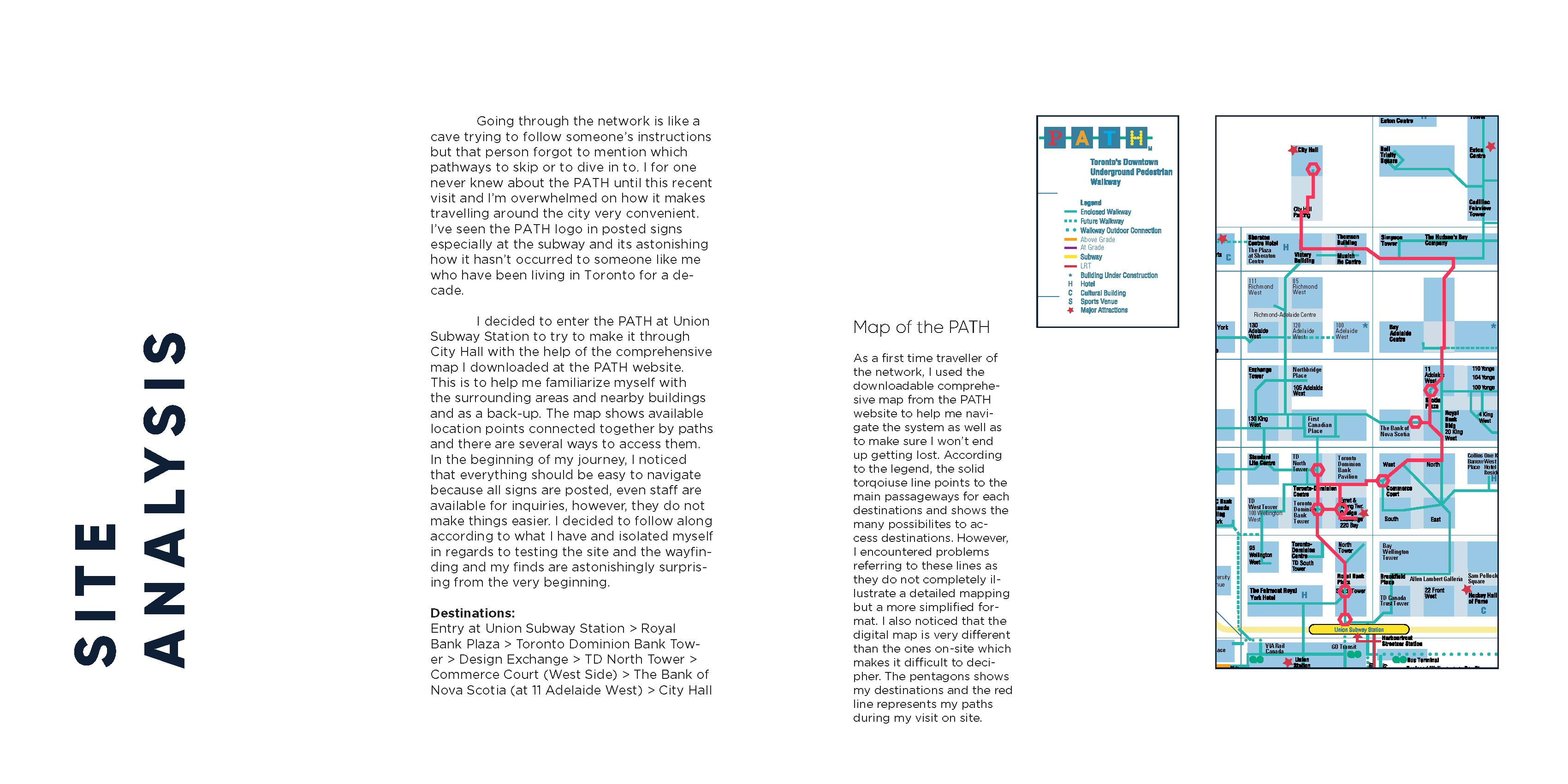
Existing wayfinding relied on inconsistent, poorly placed, and low-visibility signs. Maps were cluttered with excessive detail, often misrepresenting the actual layout of hallways and intersections. Limited accessibility features and poor lighting conditions further reduced clarity, leaving many users frustrated and disoriented.
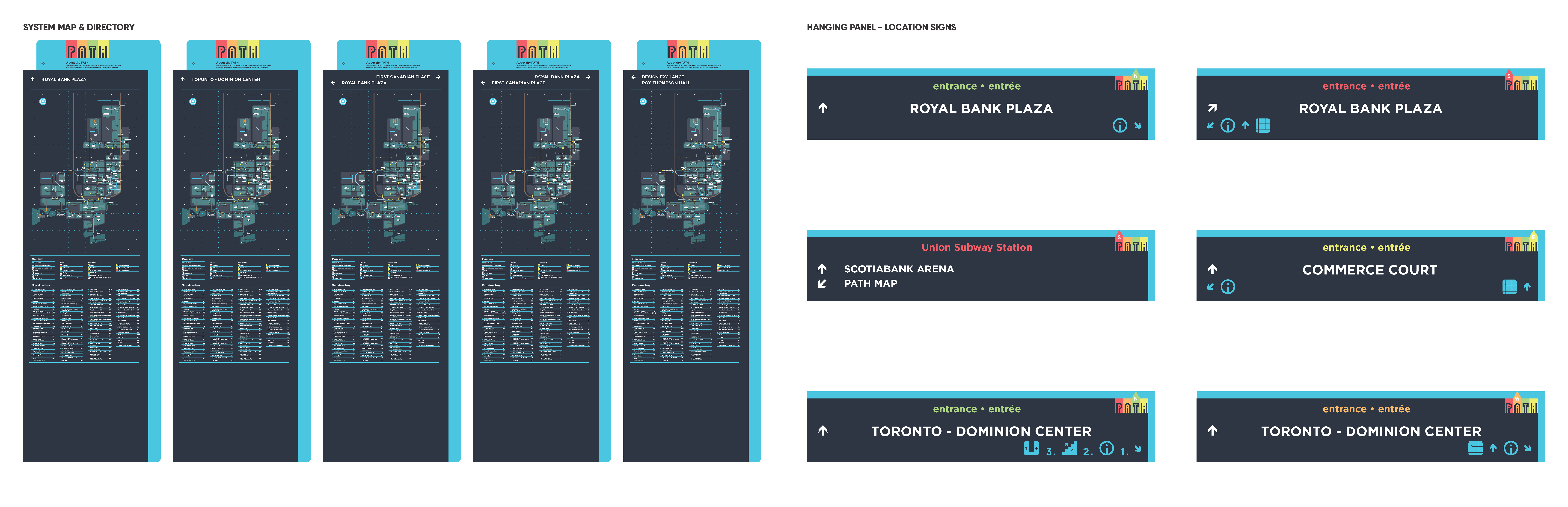
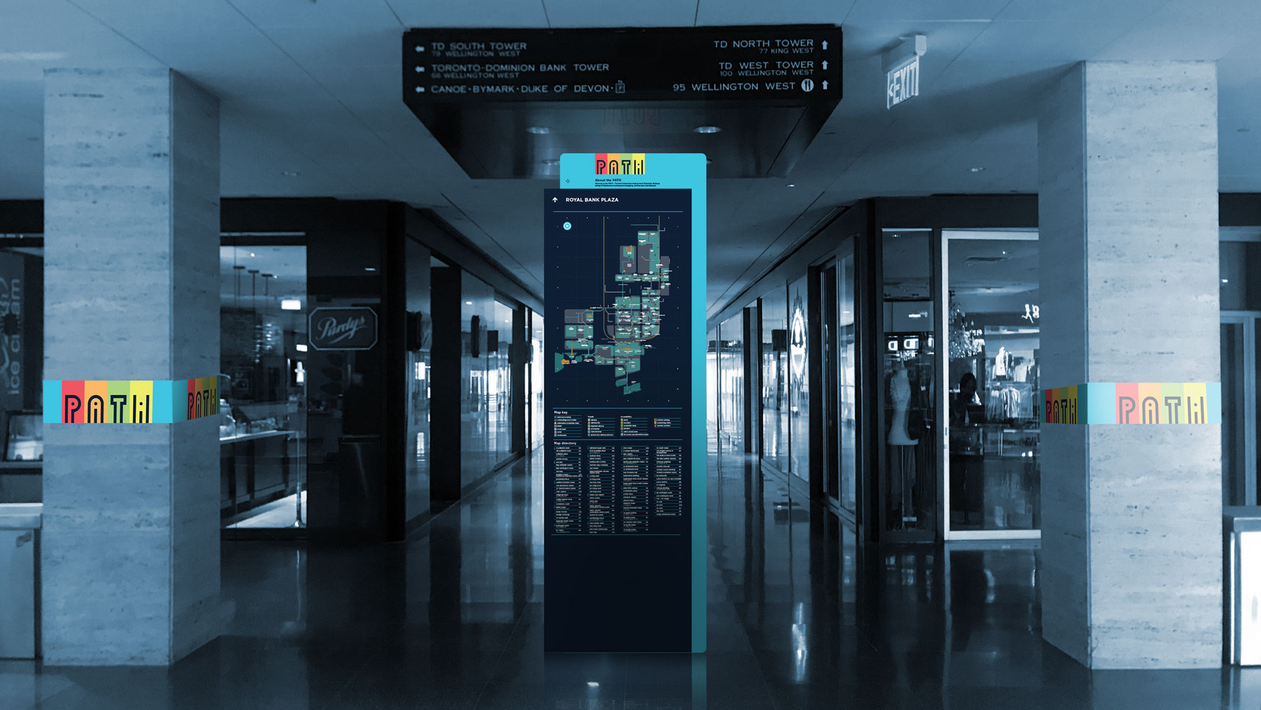
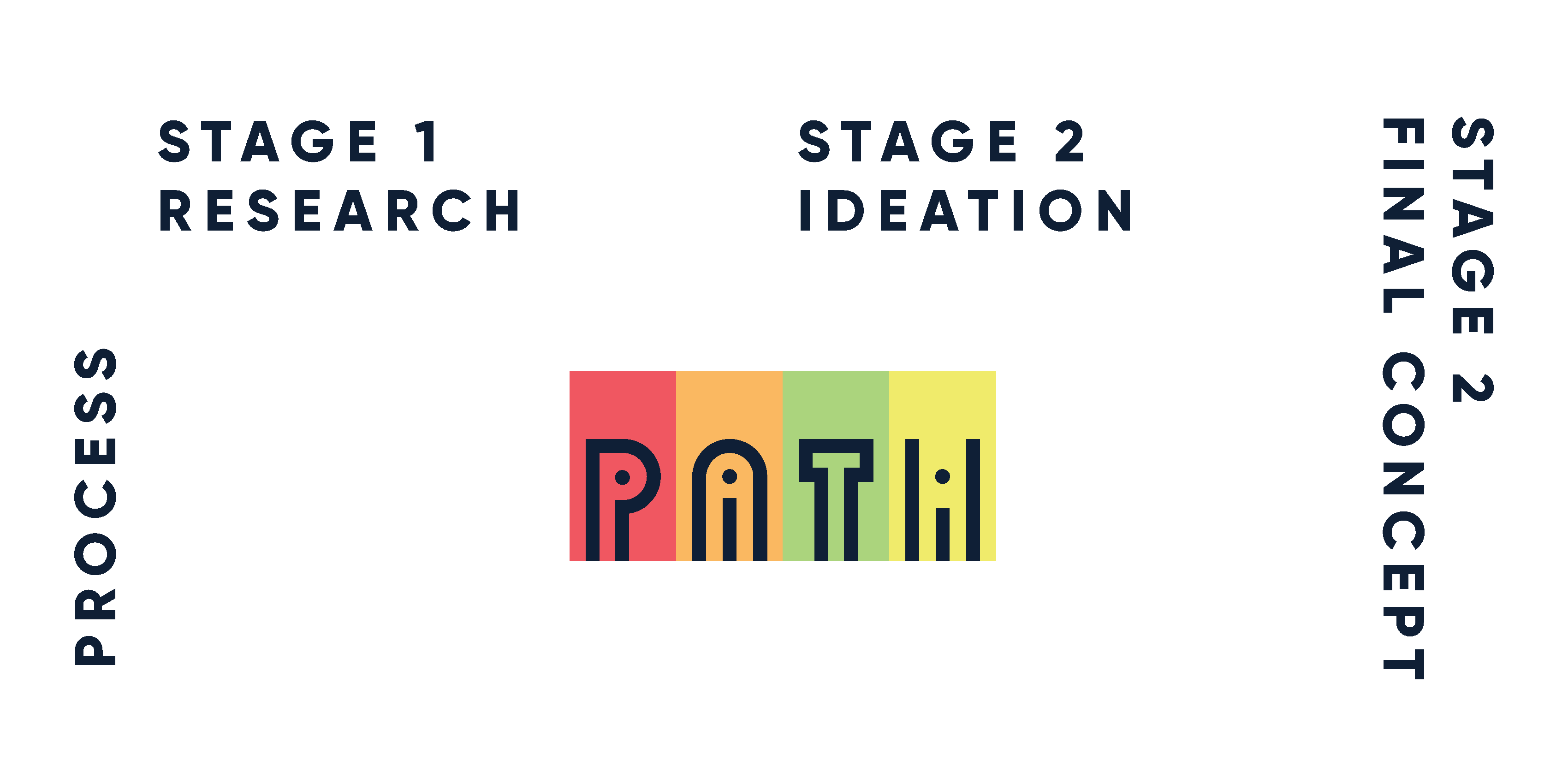
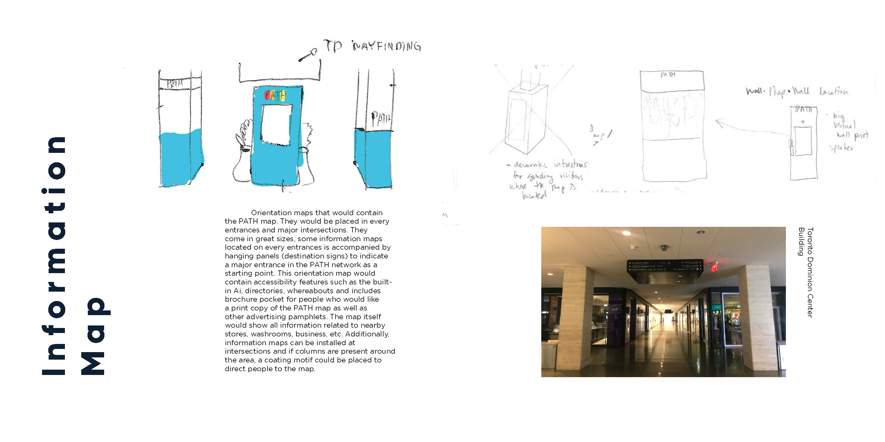
The goal was to create a unified, modern, and inclusive wayfinding system. This included simplifying the visual language, introducing consistent motifs, and improving accessibility for people with different needs. The system aimed to work both as physical signage and as a digital platform, ensuring continuity and reliability across all touchpoints.
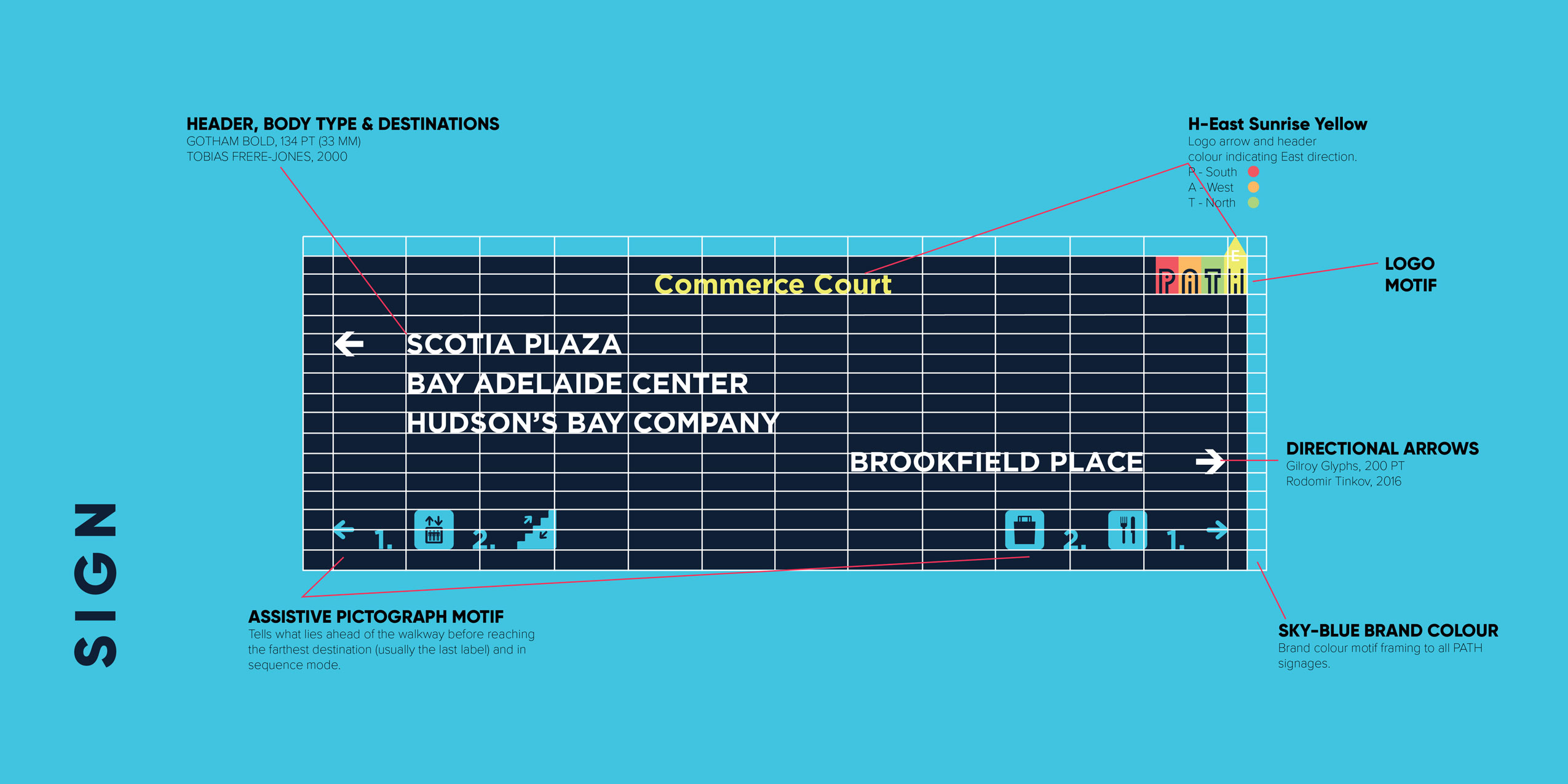
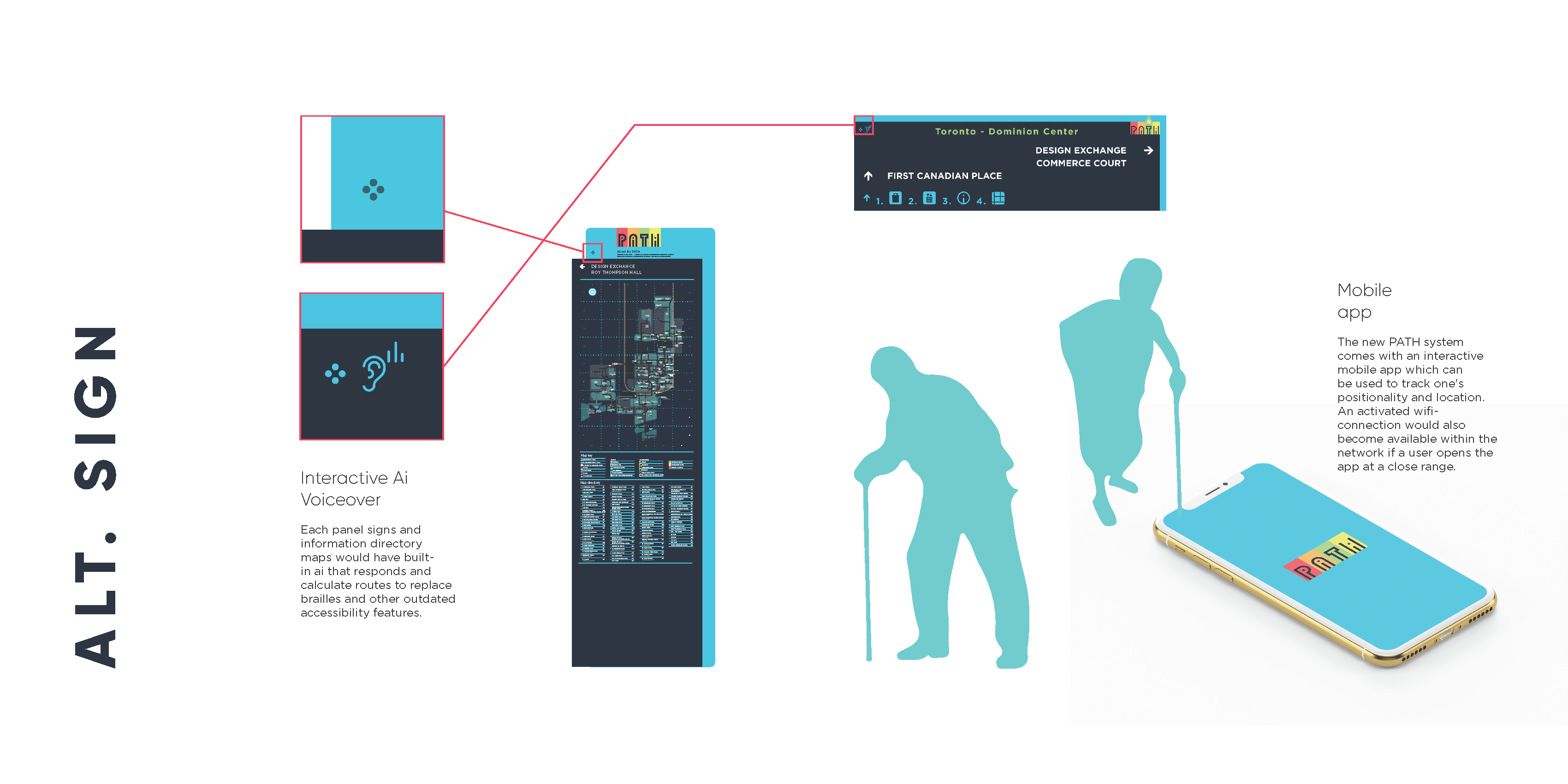
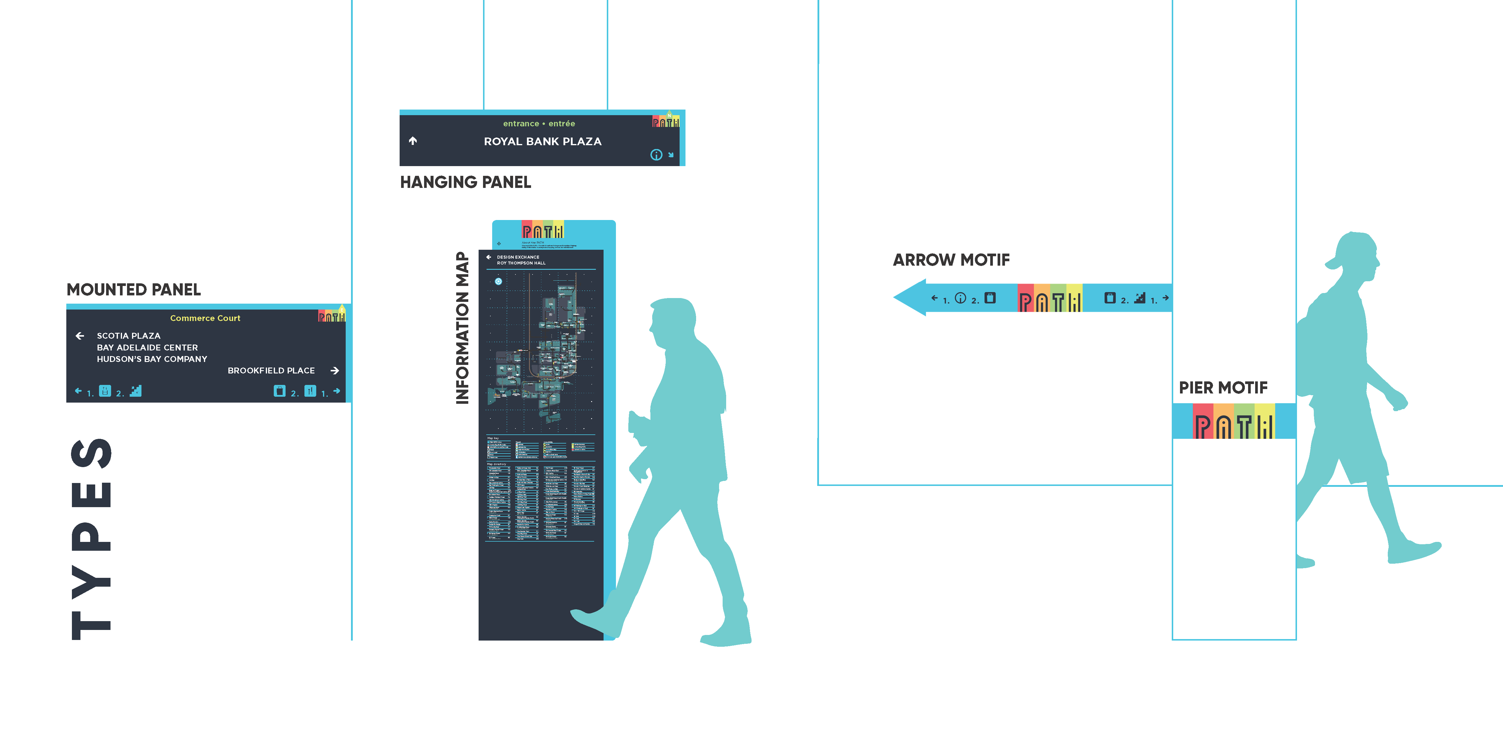
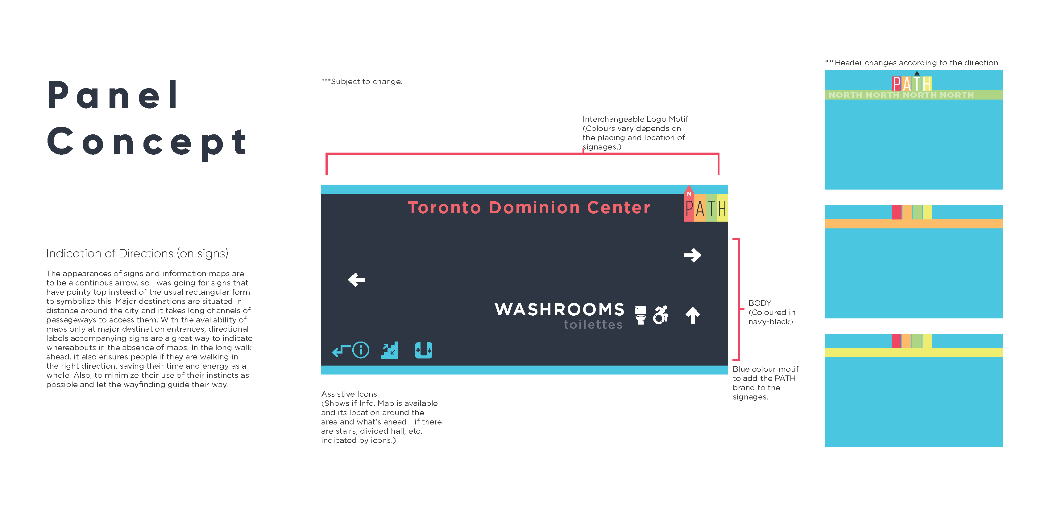
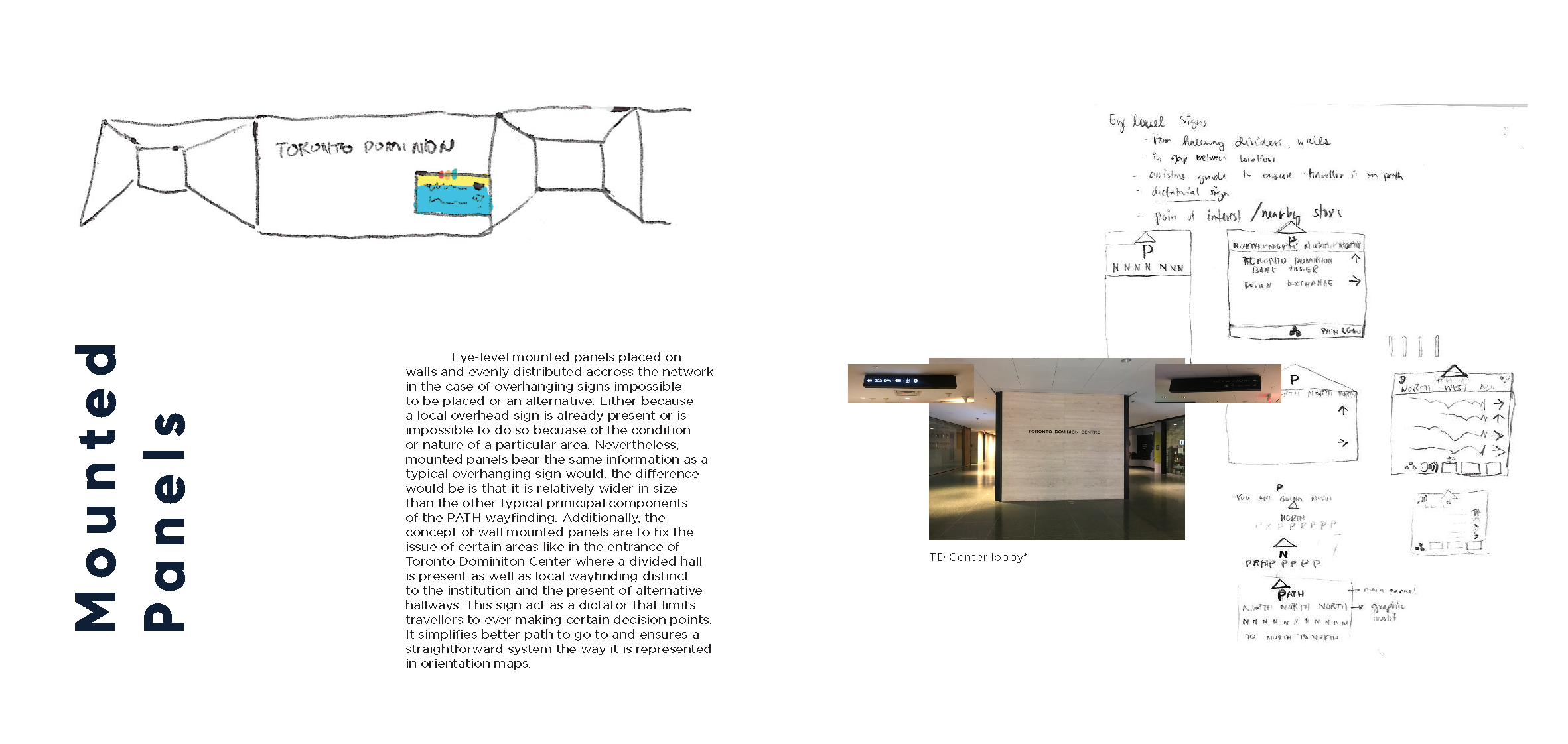
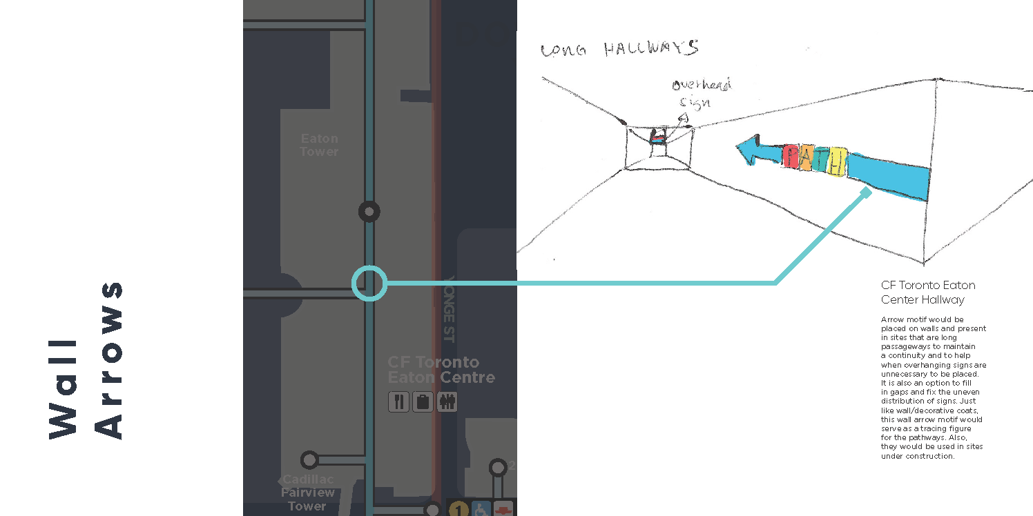
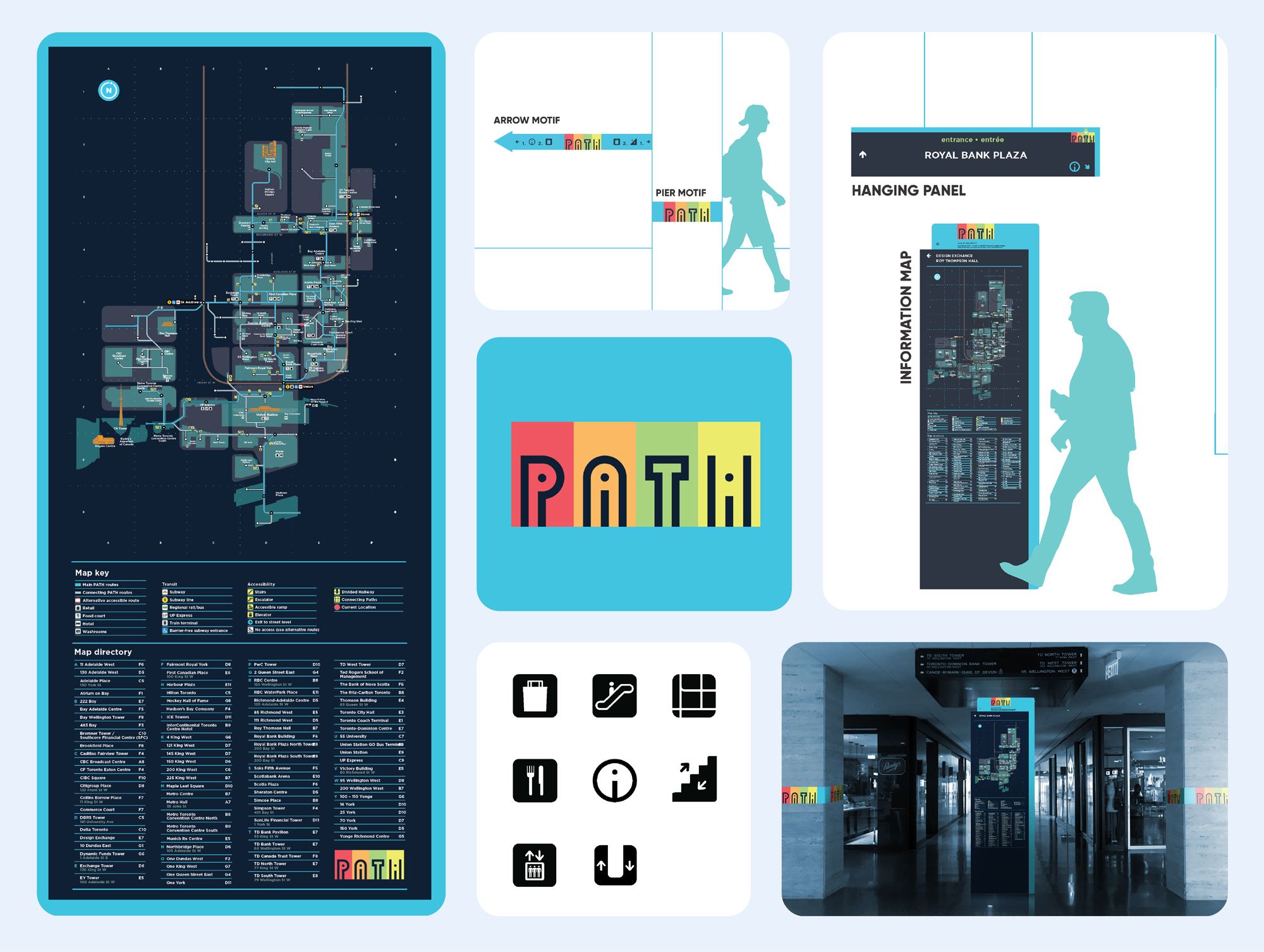
The redesign introduced a simplified map with essential landmarks and transit connections, supported by a new logotype and color-coded system tied to cardinal directions. Each sign panel integrated assistive icons—like traffic symbols—that informed travellers of upcoming stairs, branching halls, or unusual pathways, reducing surprises and confusion. To push innovation, panels incorporated AI-enabled voice assistance (“Hey PATH”) for hands-free navigation, glow-in-the-dark ink for visibility in low light, and consistent motifs like directional arrows and repetitive text patterns for easy recognition. Overall, the combination of bold design, tech integration, and accessibility ensured PATH felt clear, reliable, and distinctive for both newcomers and regular commuters.
The goal is to create a coherent visual identity that reflects clarity, direction, and confidence in movement. Each design decision—color, type, iconography—was chosen to withstand environmental challenges and ensure a universally legible system. Crucially, navigating can be stressful for travellers and by using a light hearted colour palette that evokes a sense of safety and calmness, can address this major concert. Easing the entire space and site with safety and reassurance.


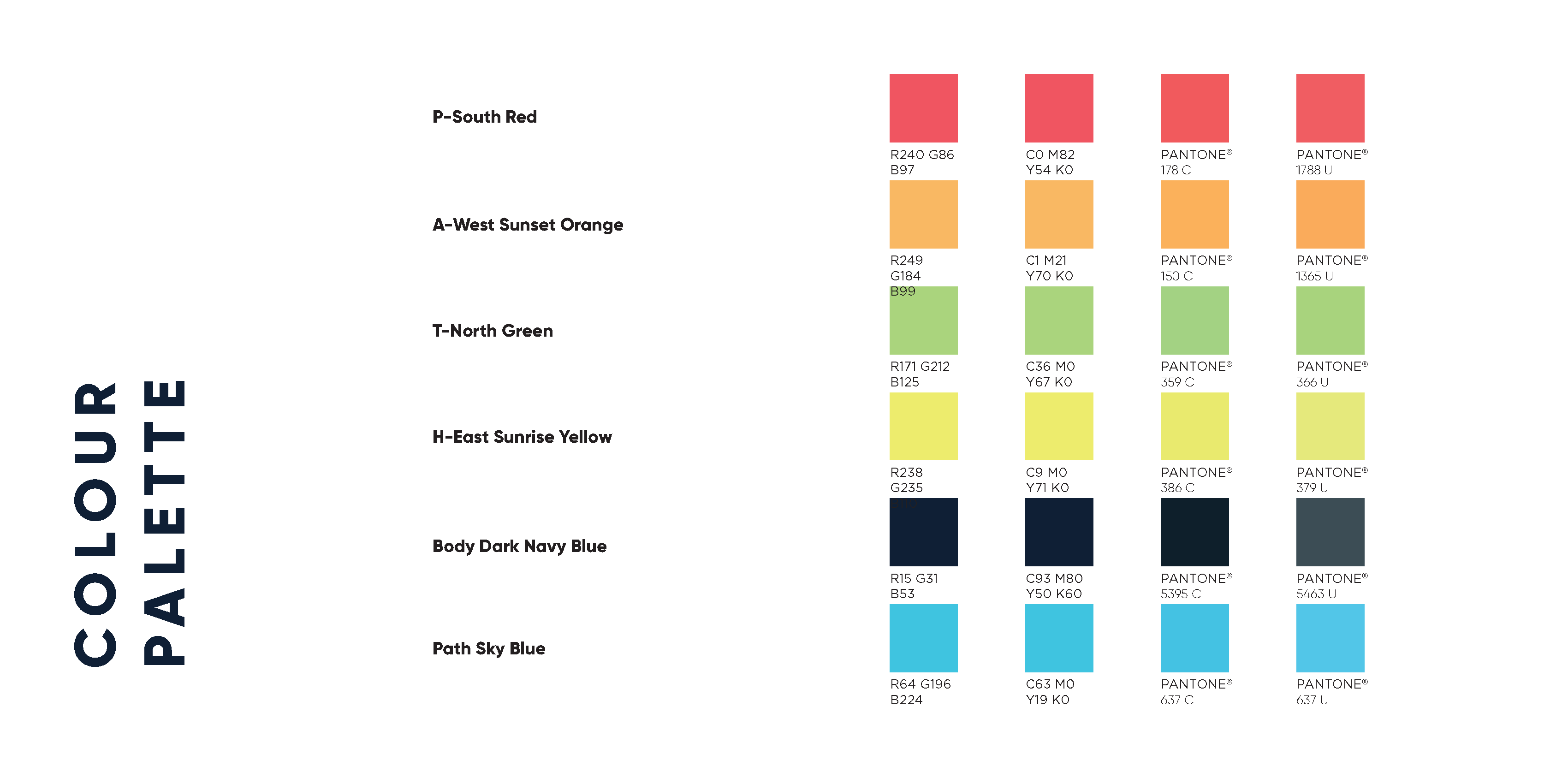
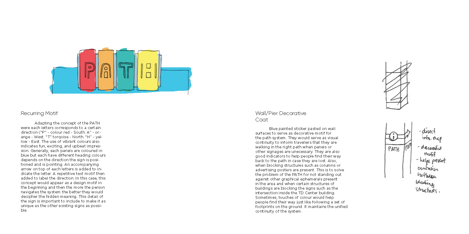
- Logo & Typography: Bold sans-serif logotype representing directions ((P/colour red = South. A/orange = West. T/torqoise = North. H/yellow = East).
- Color Palette: High-contrast hues designed for underground visibility.
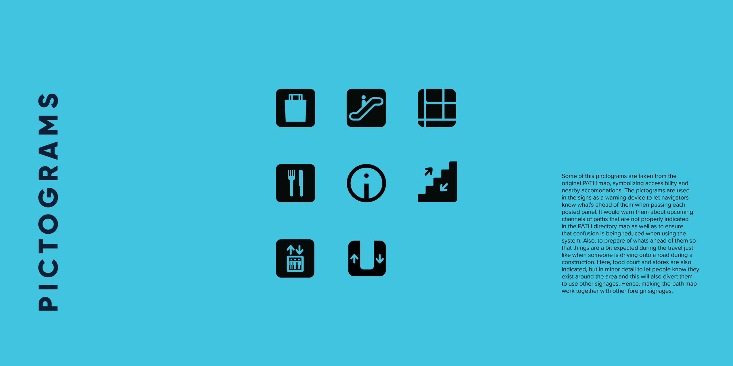
- Icons & Pictograms: Universally recognizable and scalable for both small signs and large maps.
- Signage: Directional arrows, wayfinding poles, and wall-mounted guides strategically placed at key junctions.
- Digital Companions: Mobile app mockups, interactive kiosks, and downloadable pamphlets.