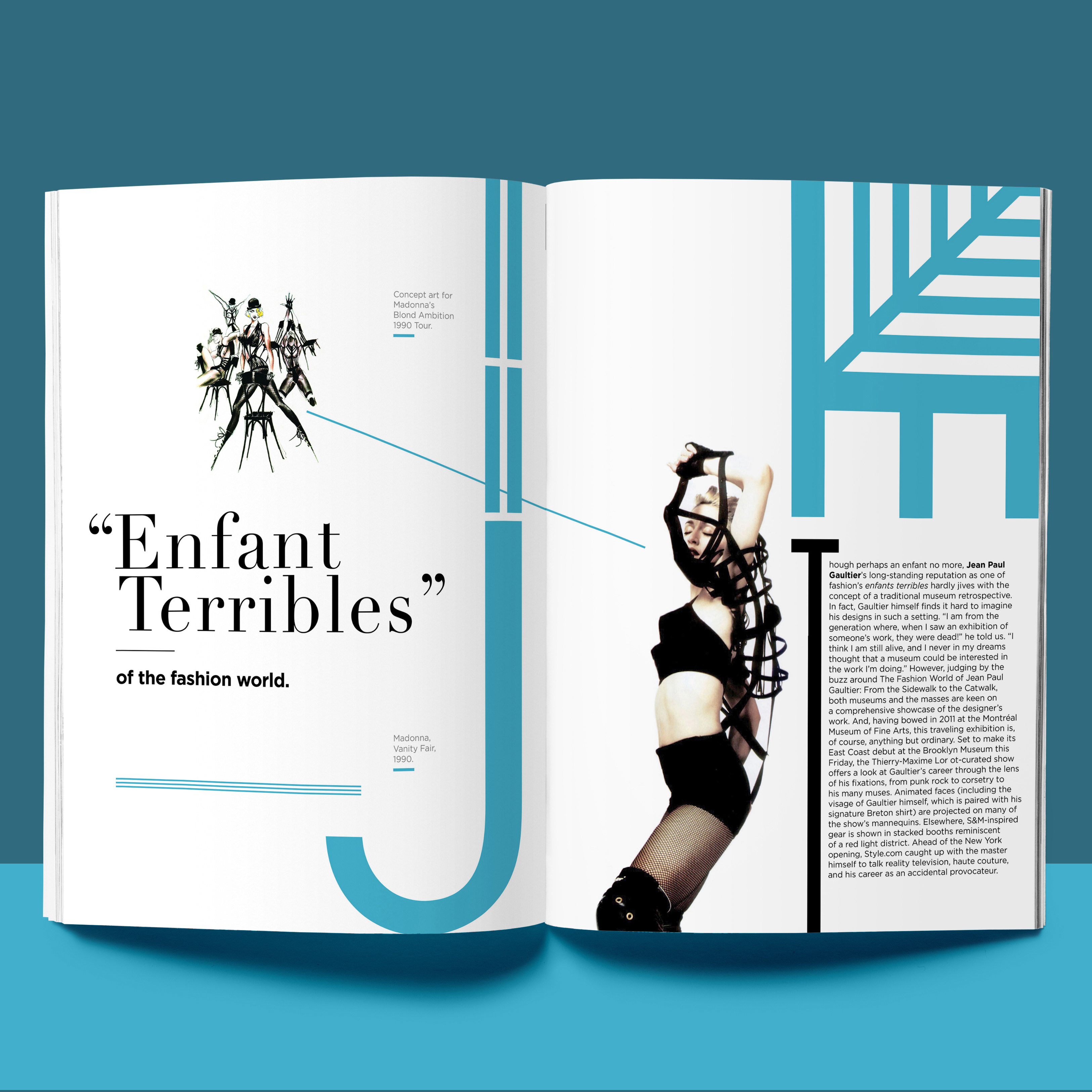
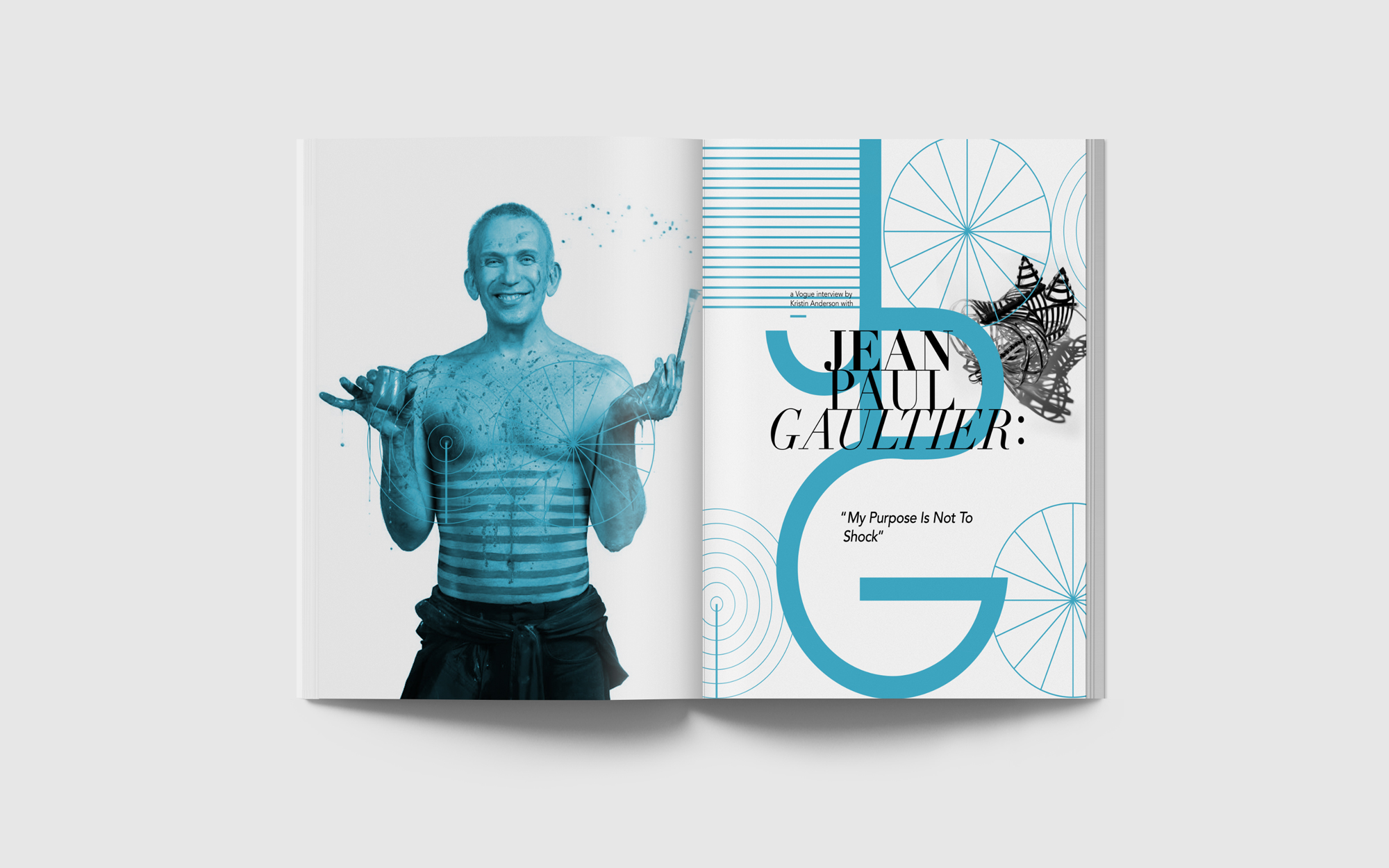
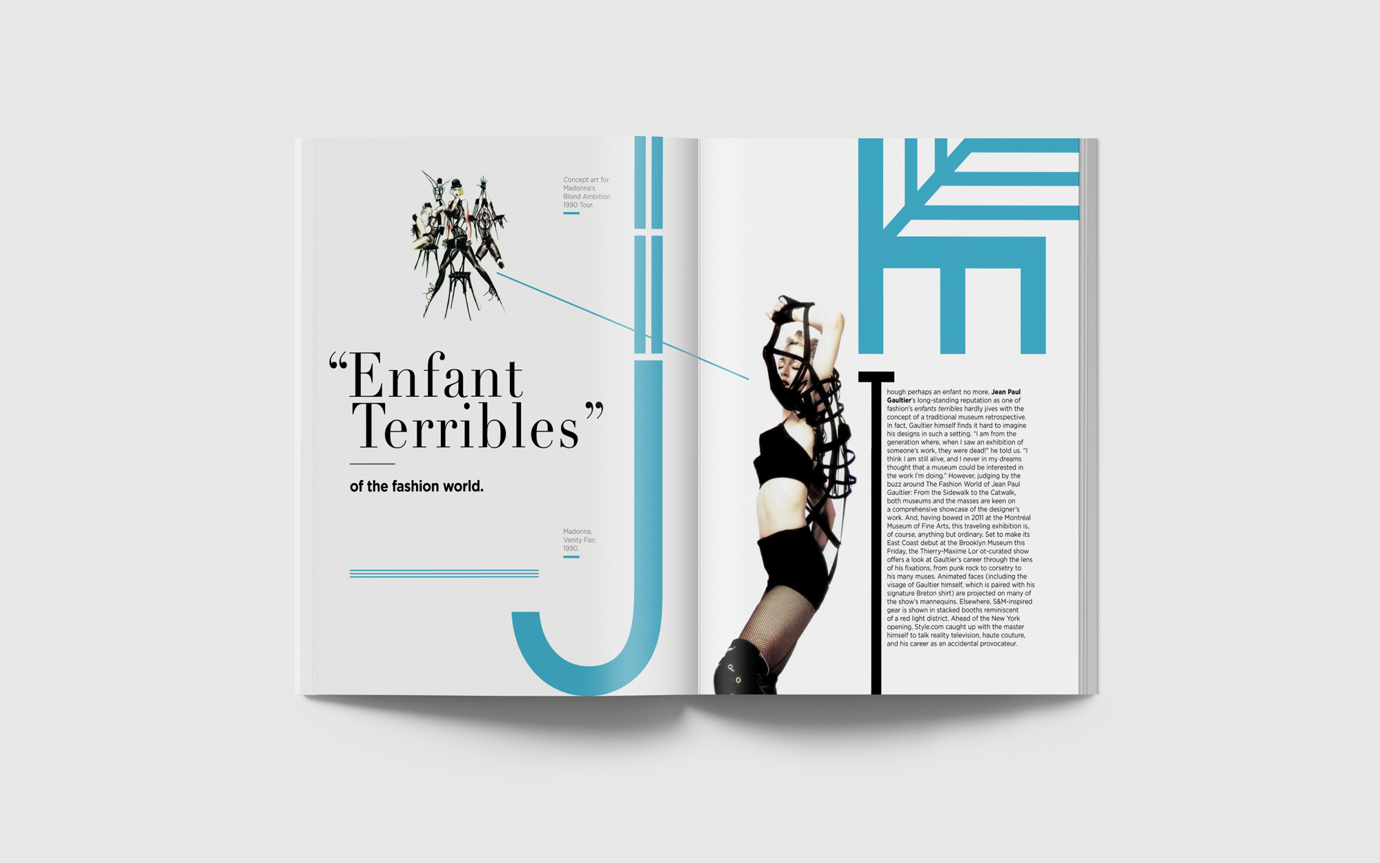
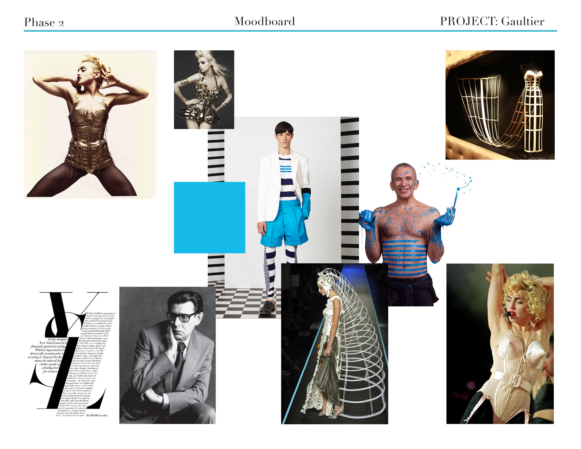
An editorial tribute to Jean-Paul Gaultier, this brochure channels his avant-garde spirit and “Enfant terrible” reputation into print. Using bold stripes, expressive typography, and his signature cerulean blue, the design reflects his eccentricity while immersing readers in a world that is daring, stylish, and rule-defying.
Capture Gaultier’s unconventional and rebellious fashion language in a print format that feels authentic to his legacy and introducing his work to a casual audience.
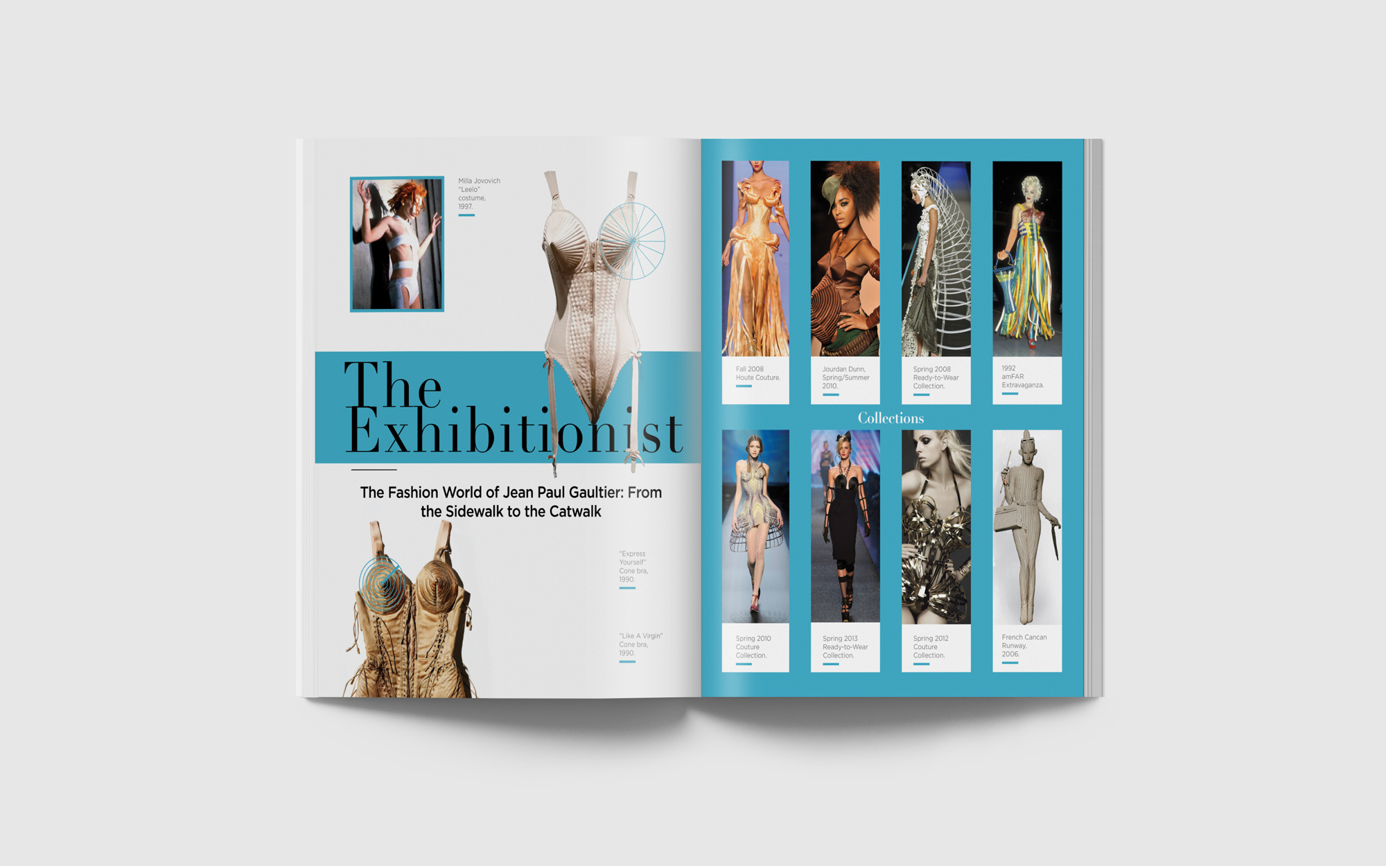
Design a brochure that not only showcases his iconic collections but also embodies his eccentric style, appealing to both fashion enthusiasts and casual viewers.
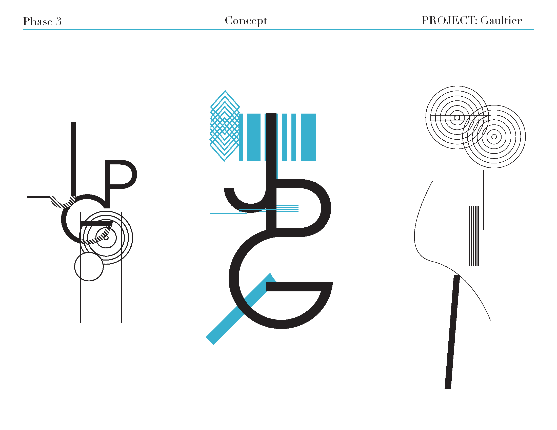
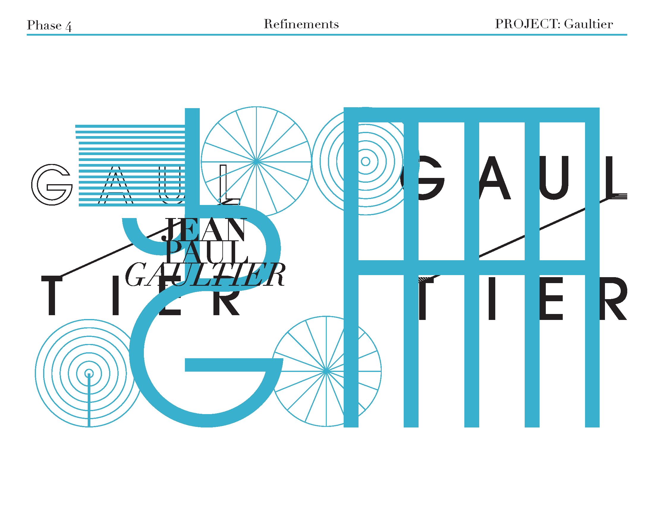
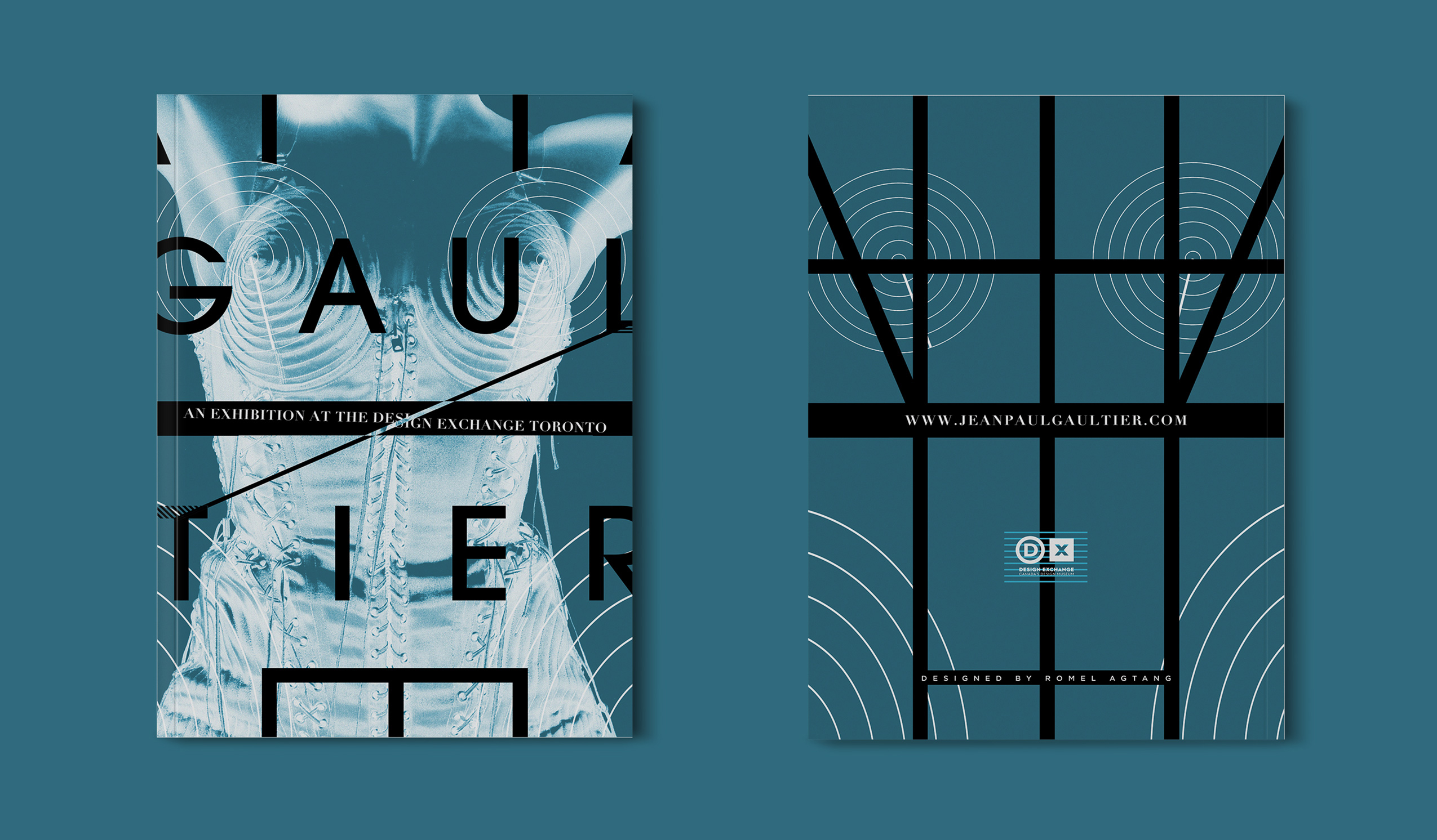
The final edition weaves stripe motifs with linear sans serif type and the elegance of Didot, accented by cerulean blue. The layouts intentionally bend traditional editorial rules, resulting in a piece that mirrors Gaultier himself—edgy, sophisticated, and unapologetically bold.
The brochure embraces Jean-Paul Gaultier’s rebellious yet refined identity by translating his runway aesthetic into an editorial experience. Inspired by his iconic use of stripes, bold lines, and striking contrasts, the design creates a visual rhythm that feels energetic, avant-garde, and fashion-forward. Each spread plays with structure and disruption, reflecting his philosophy of breaking rules while maintaining elegance.

Key design elements include woven stripe motifs in varying weights, a mix of linear sans serif type with the timeless elegance of Didot, and accents of Gaultier’s signature cerulean blue. These choices frame his most iconic designs while reinforcing his distinctive style. By layering abstracted forms, unconventional layouts, and strong editorial composition, the brochure becomes an immersive extension of Gaultier’s world—both stylish and daring.