“As A Feather” is a visual identity and branding project created for Vai Williams Dance Company’s debut performance. The show explored the dancer’s personal journey through despair, alienation, resilience, and healing — a deeply autobiographical reflection of fragility and strength. Commissioned as the visual designer, I crafted the logo, programme, and promotional assets that mirrored the emotional phases of the performance.
The challenge was to create a brand identity that visually expressed the emotional arc of the performance — from darkness to light, from isolation to celebration — while maintaining a cohesive aesthetic across print and digital media. The visual language had to feel personal yet professional, embodying both the grit of street dance and the grace of contemporary performance.
To design a complete visual system — logo, show programme, posters, and social media assets — that communicates the show’s emotional narrative, guides the audience through the performance, and amplifies its promotional reach both online and offline.
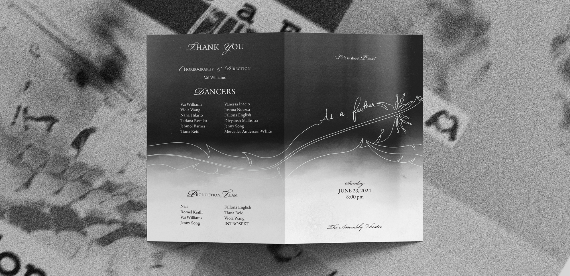
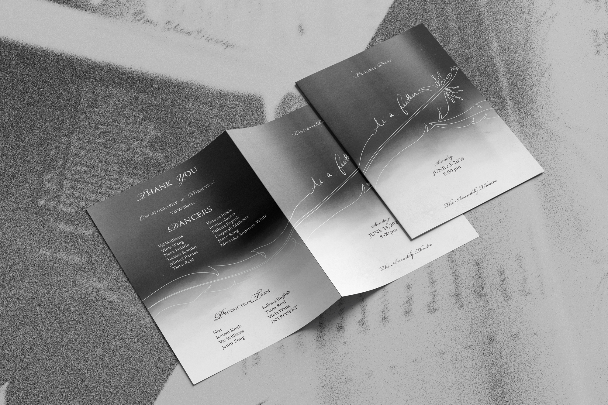
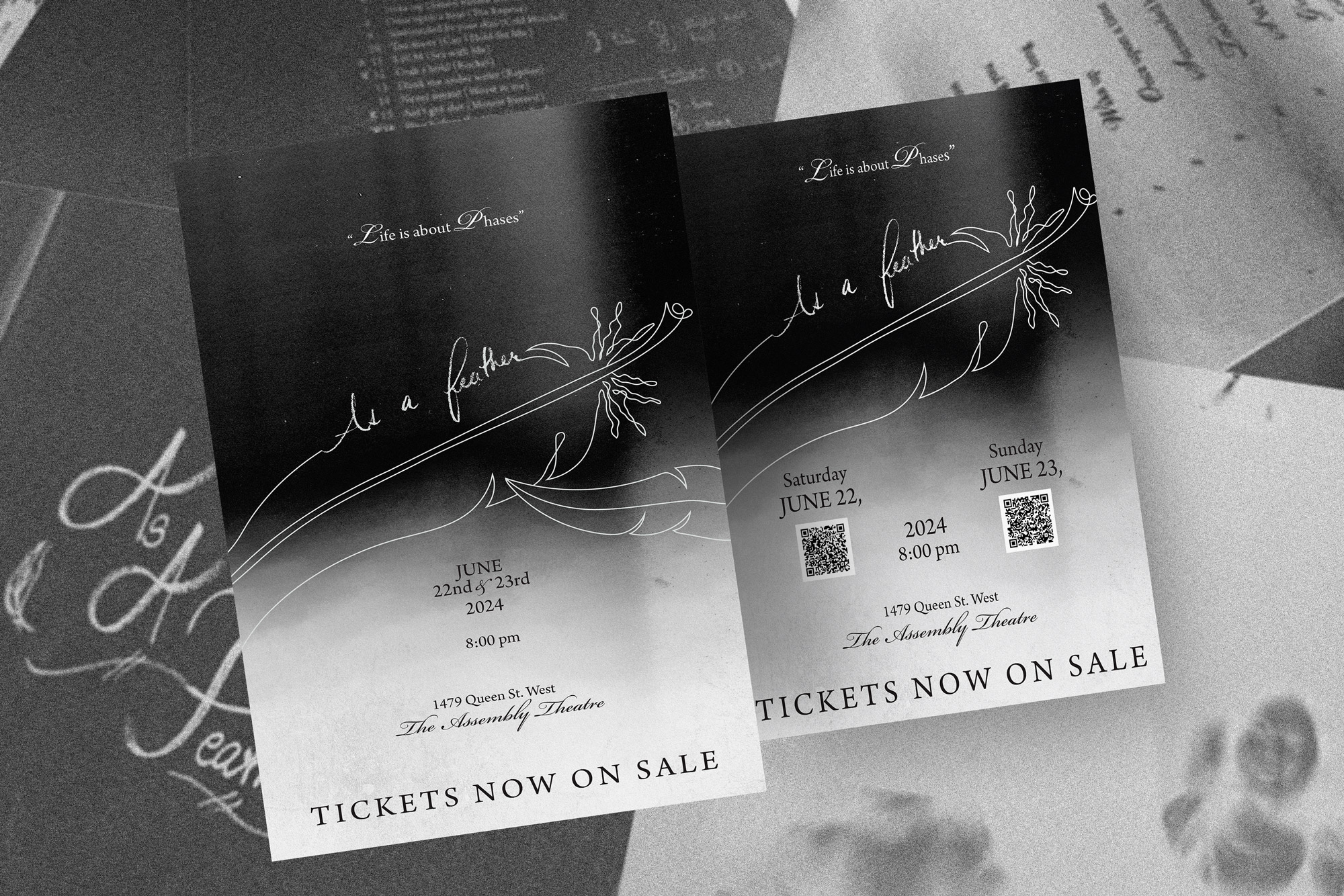
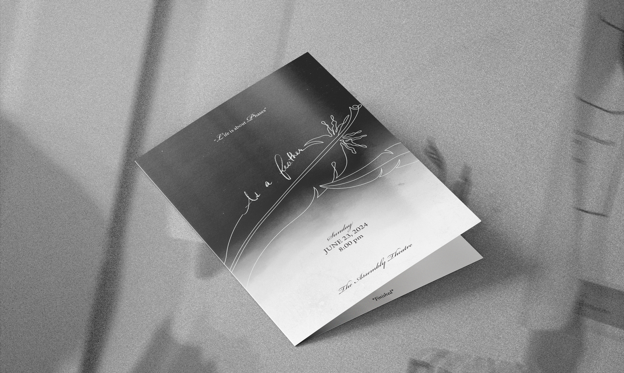
A cohesive set of branded assets was developed including a show programme, social media story ads, and promotional posters. Each element visually narrated the show’s story while ensuring practical functionality. The assets created a strong, recognizable identity that unified the entire production under one visual theme.
The visual identity draws from a black-and-white Xerox-inspired aesthetic, representing imperfection, movement, and raw emotion. Gradients moving from dark to light echo the show’s two-part structure — beginning with despair and ending with renewal. The hand-drawn feather-inspired logo symbolizes fragility, artistry, and persistence — a visual metaphor for a dancer’s ability to rise above adversity with lightness and grace.

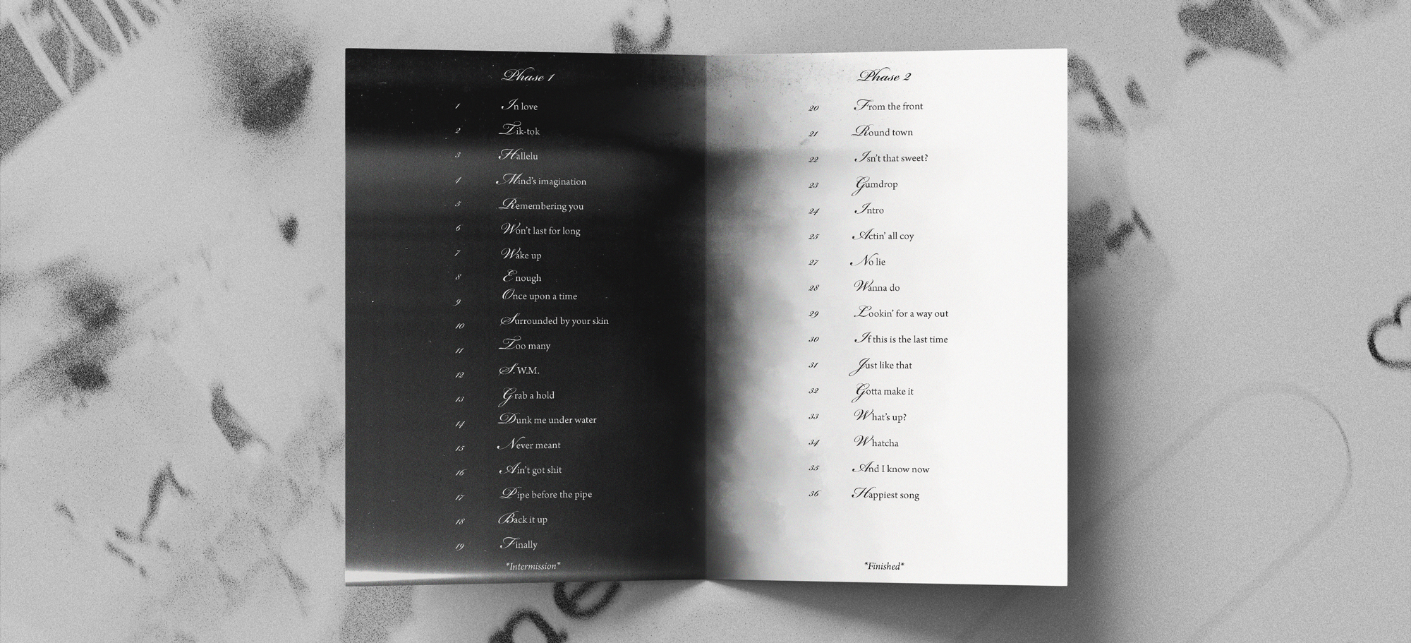
Typography: Hand-illustrated letterforms evoke personal struggle and creativity. Colour Palette: Monochrome tones with transitional gradients to express the journey from hardship to hope. Imagery: Grainy textures, high contrast photography, and minimalist layouts reinforce the gritty yet poetic tone. Layout: Two-part structure guiding the audience’s emotional flow, aligning with the tracklist progression from somber to celebratory.