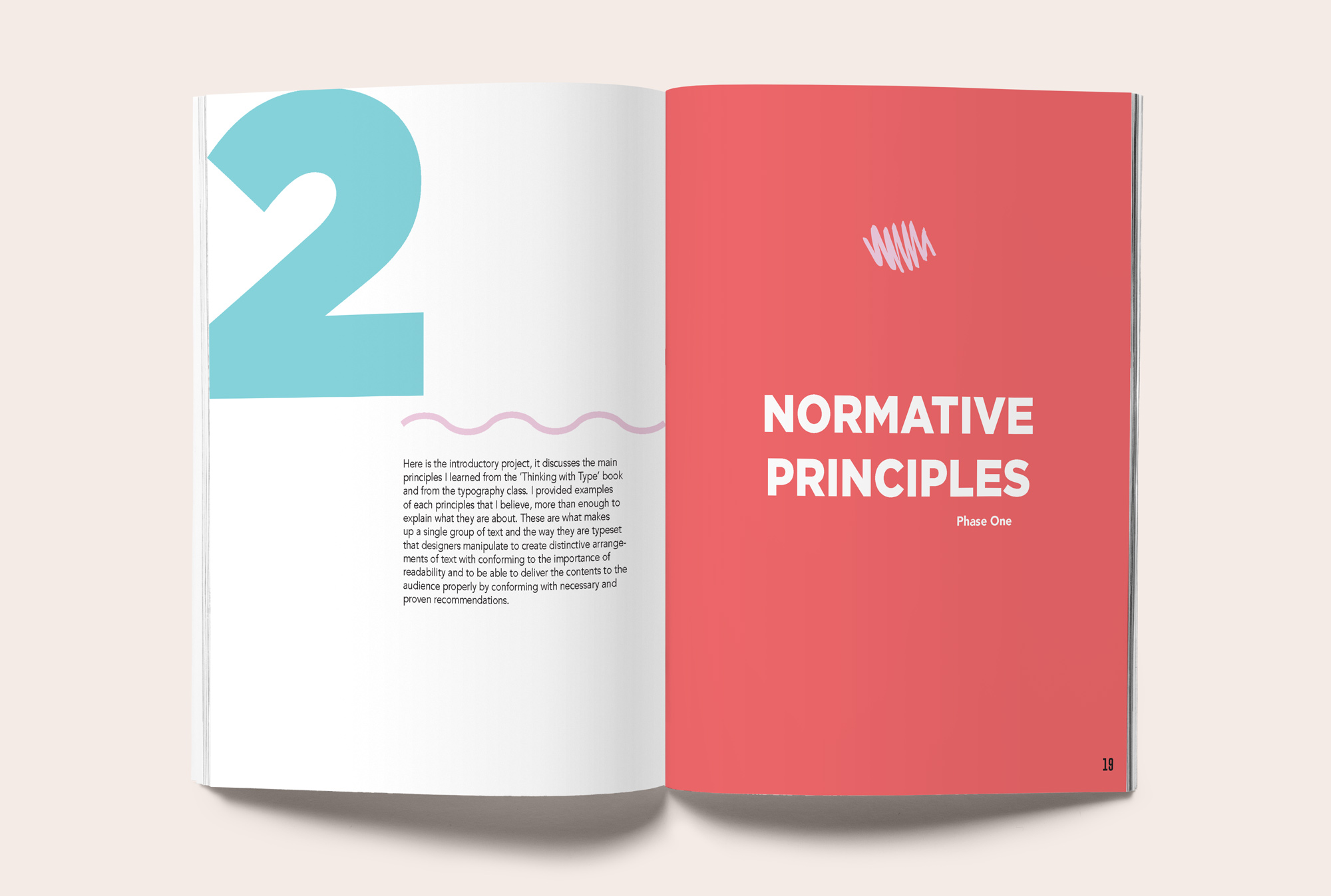
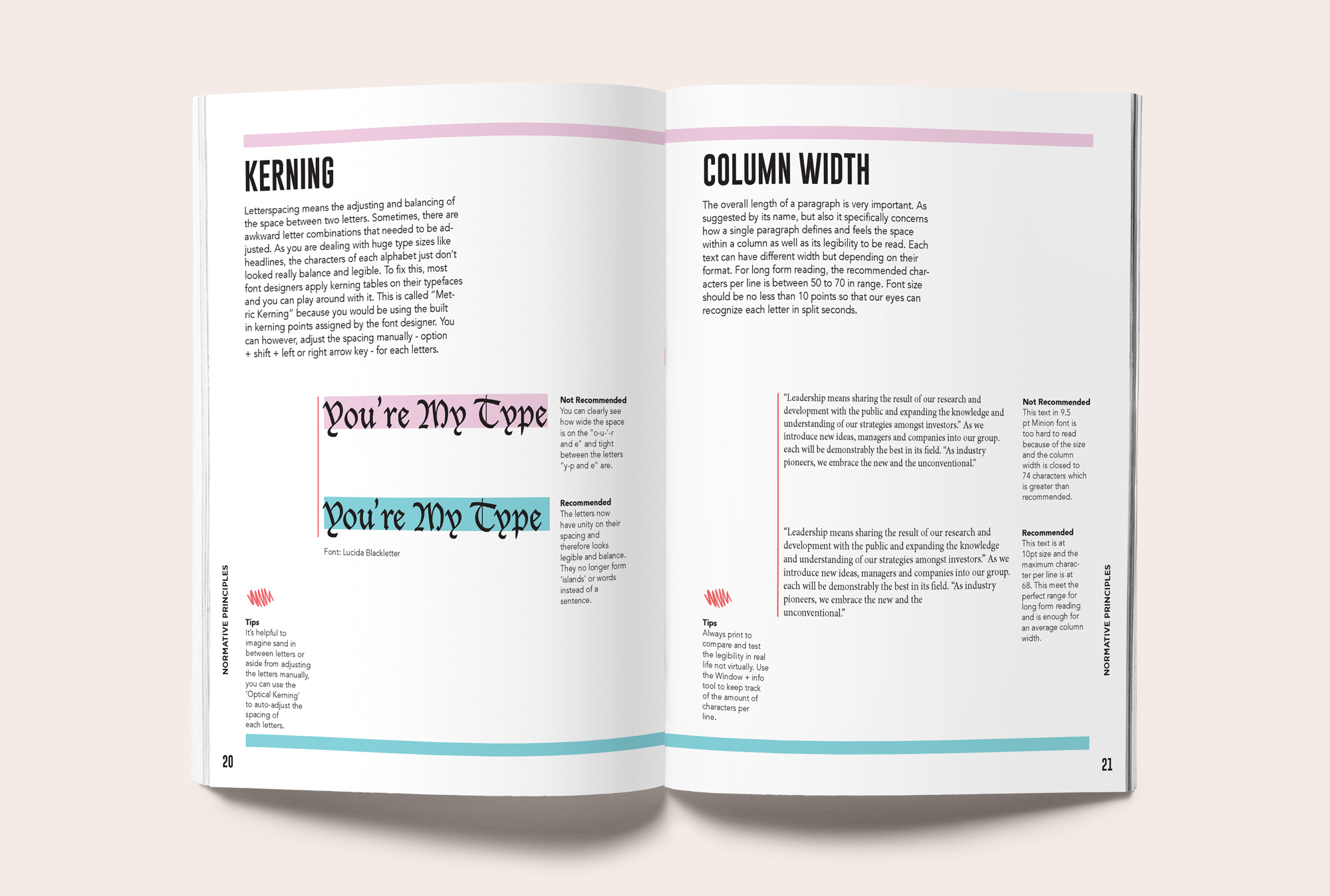
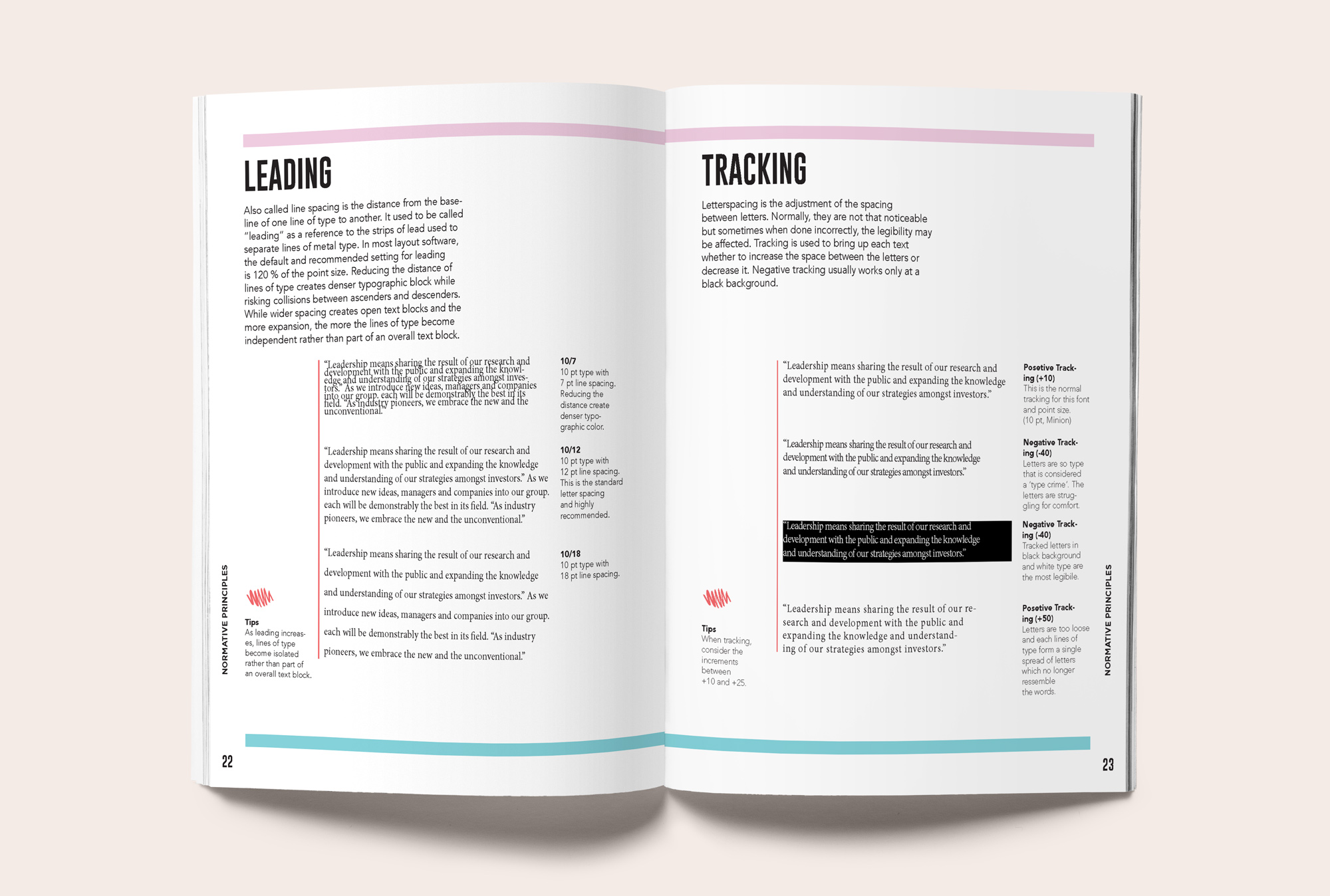
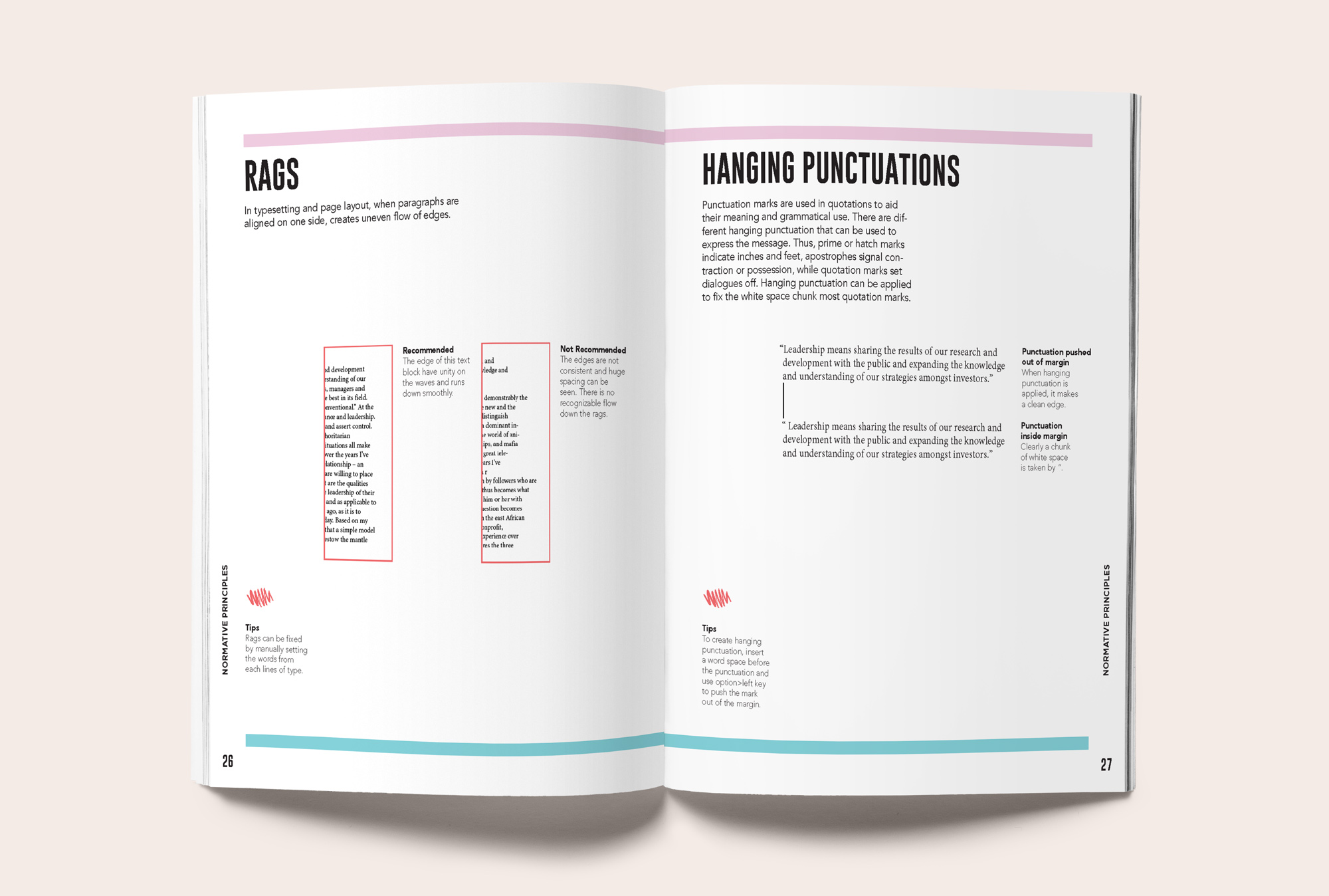
Treat type like food, bring all the ingredients together to cook a delicious cuisine of texture and flavours. Creating a book from learning typography is fun and practical. Basically, writing it all down and applying what I’ve learned so far. In this design challenge, I created a book that expresses the fun use of type, its history, theory, and technical use. More importantly, the whole book is a reflection of one’s understanding of its purpose. It details that type can be used chaotically, firmly, traditionally, and expressively like cooking. Adding spices and experimenting can either improve the recipe or elevate it to a new one.
Typography can often feel rigid, overly technical, or confined to traditional rules. As a student learning type for the first time, I wanted to push past the theory and explore how type could also be expressive, experimental, and fun. The challenge was to translate my learning process into a tangible piece that captured both the structure and play of typography.
To create a book that reflects my personal exploration of type — combining history, theory, and technical practice with a fresh, metaphorical approach. The goal was to design an editorial system that communicates type as something dynamic: like cooking, where ingredients can be carefully measured or wildly experimented with.
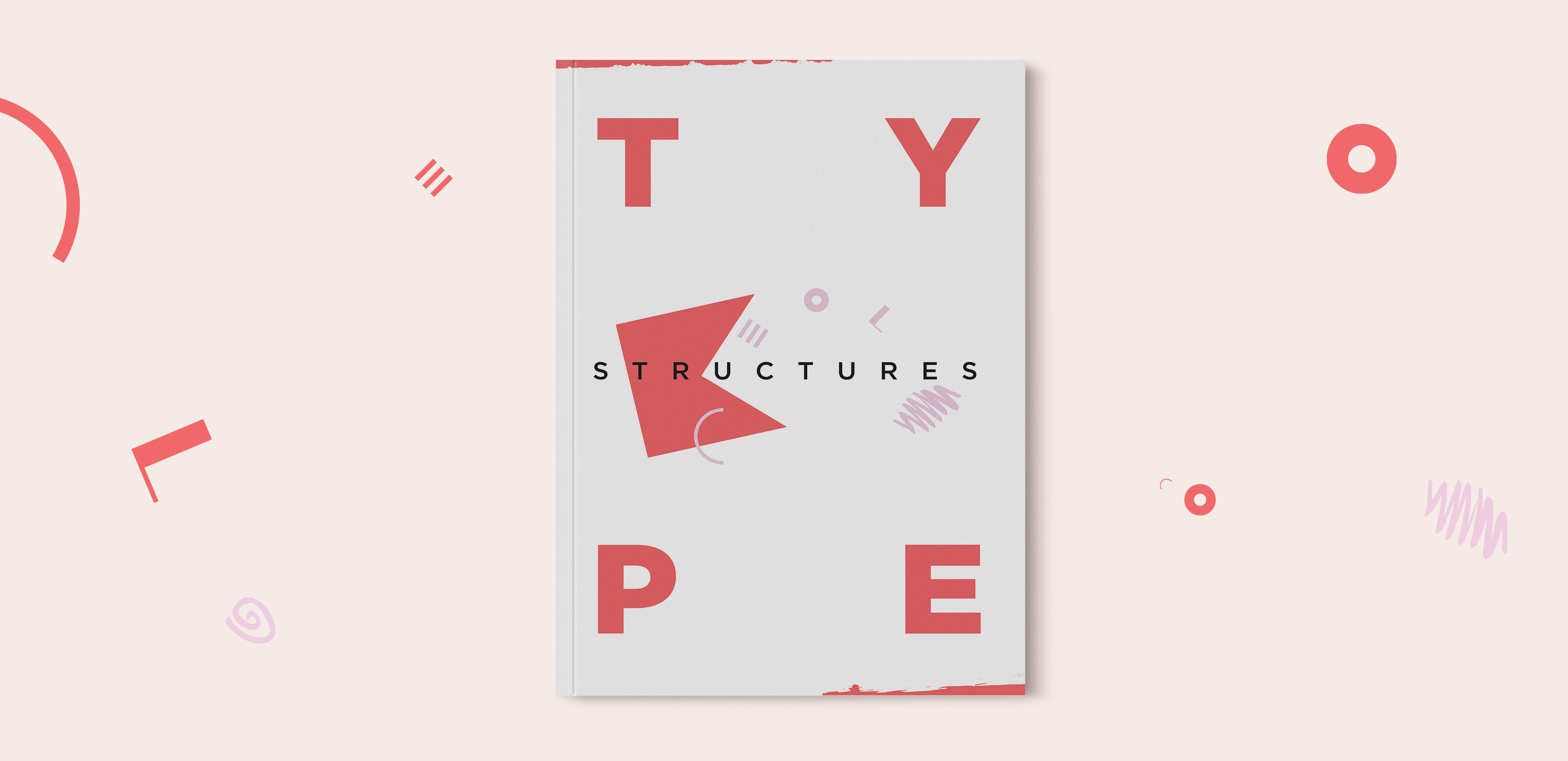
A book inspired by Memphis design language and geometric abstraction. The layouts, colors, and motifs treat type as both structure and ornament, blending clarity with playful experimentation. By framing typography as a recipe of textures and flavors, the project transformed a learning exercise into an expressive editorial piece that celebrates type as both functional and creative.
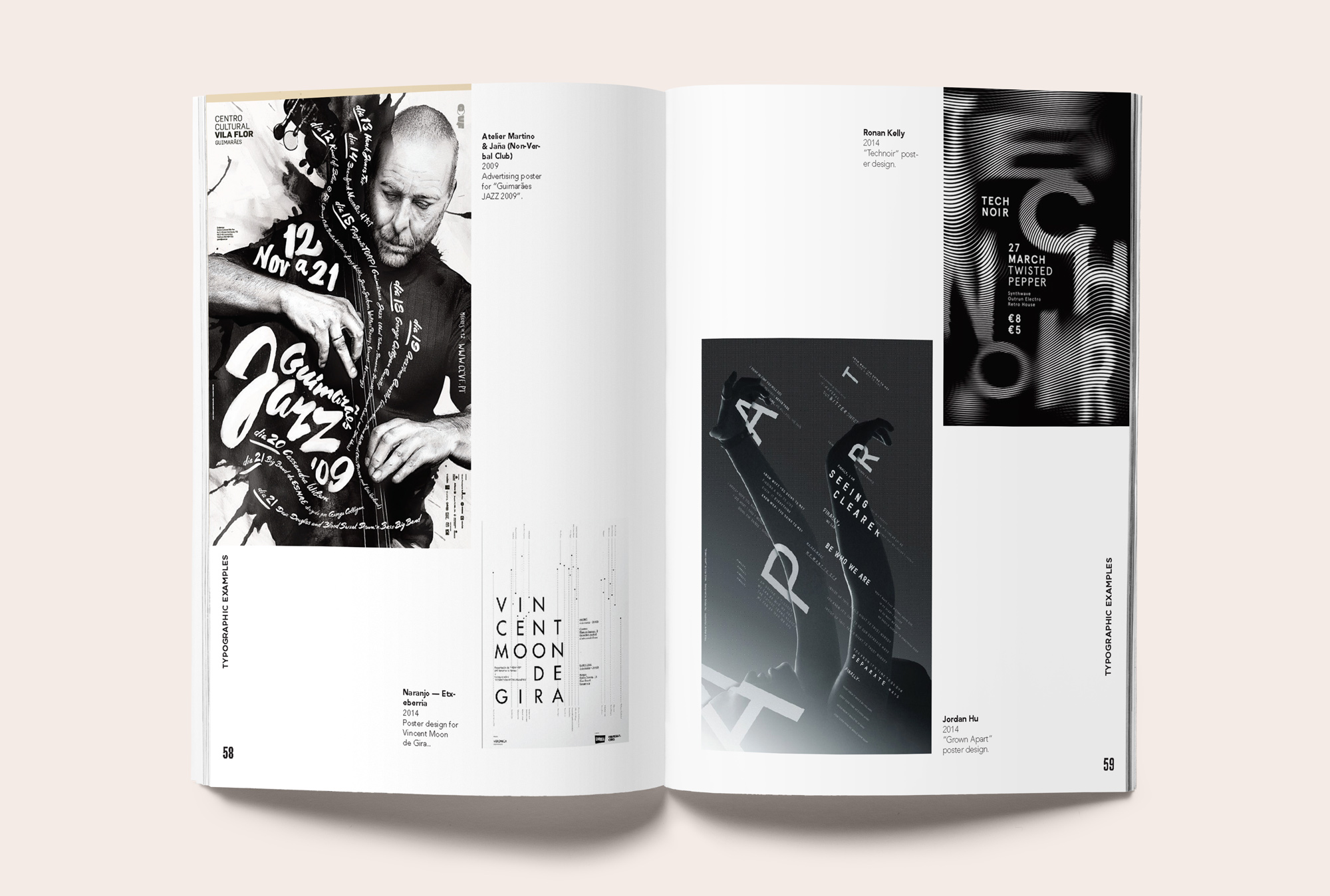
The visual concept of Type Structures frames typography as both structure and play — a recipe of forms, flavors, and textures. Inspired by Memphis design, the layouts use bold geometric shapes, vibrant colors, and rhythmic compositions to mirror the expressive potential of type. Typography is treated not only as a tool for communication but as an ingredient for experimentation, allowing letters to act as both the main dish and the garnish. This playful, abstract approach creates a book that feels energetic, inventive, and reflective of a designer learning to both respect and reimagine typographic rules.

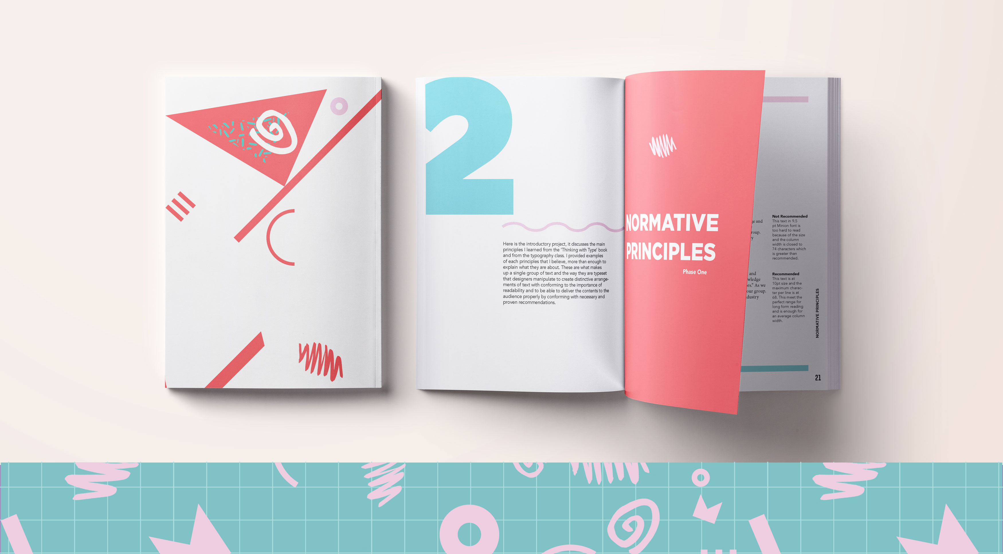
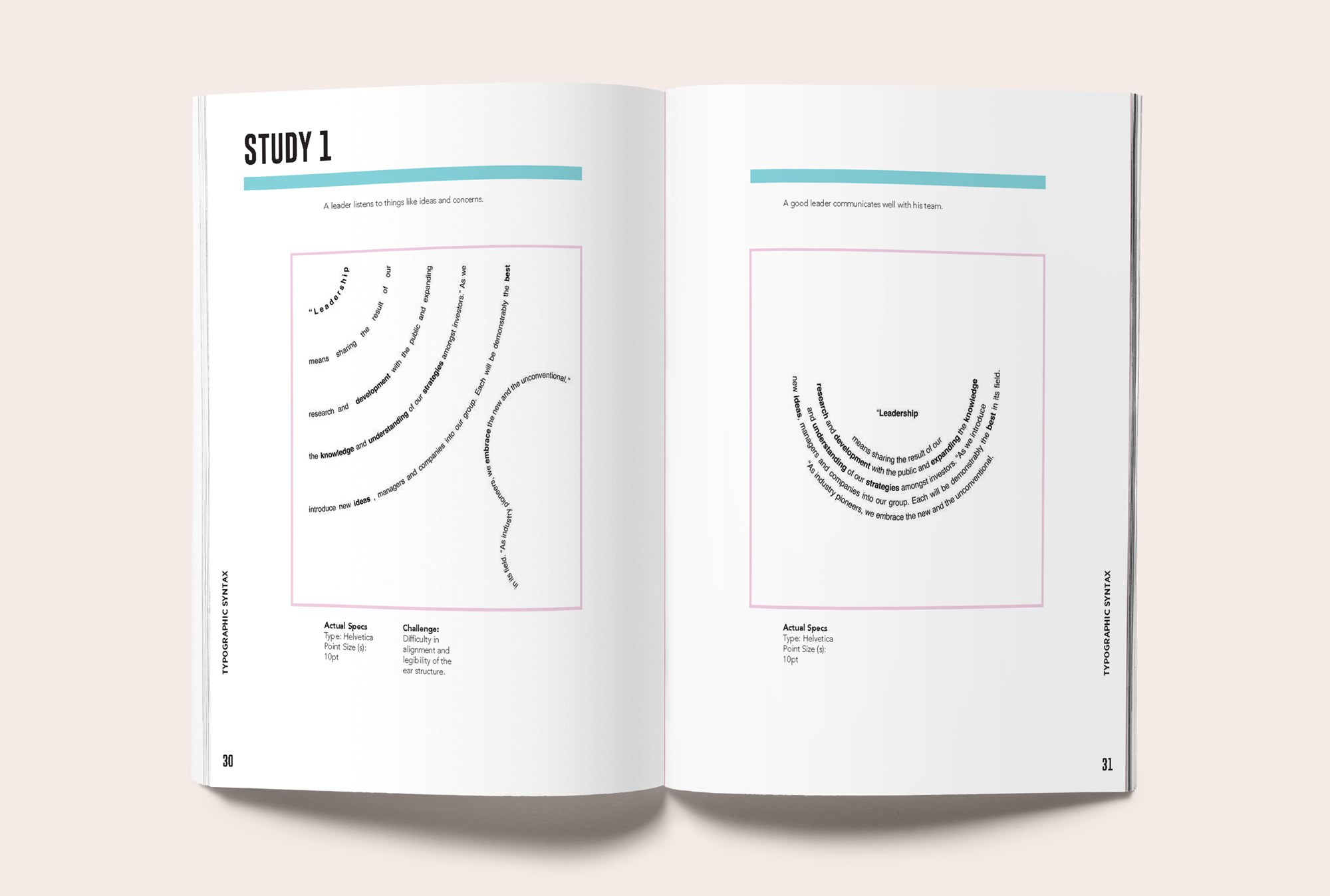
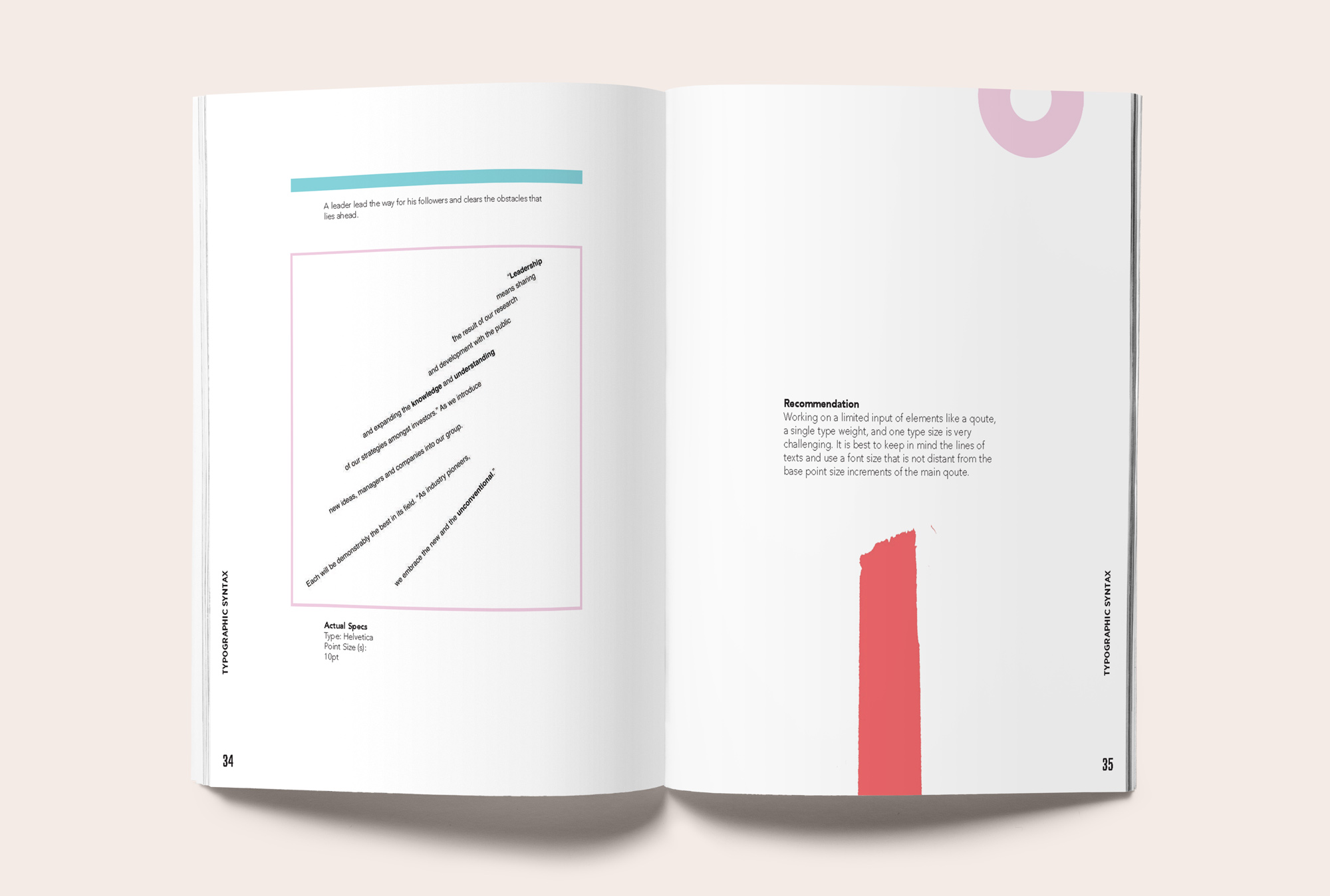
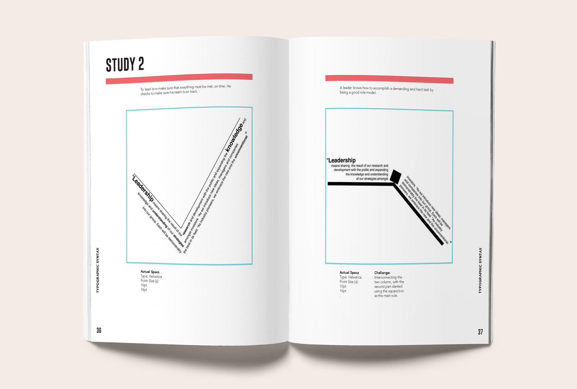
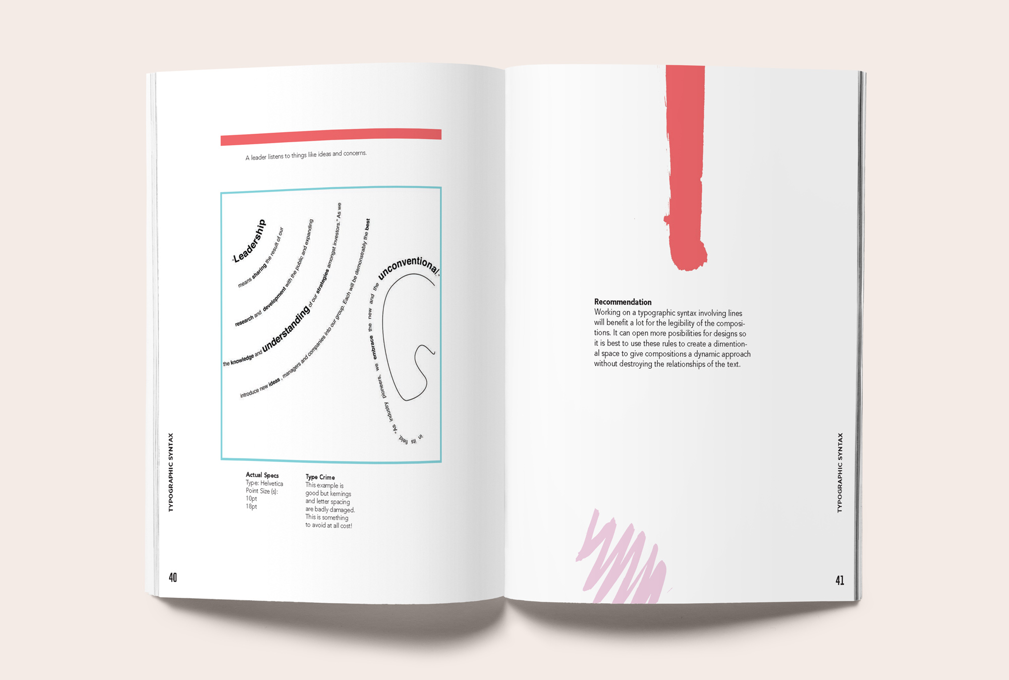
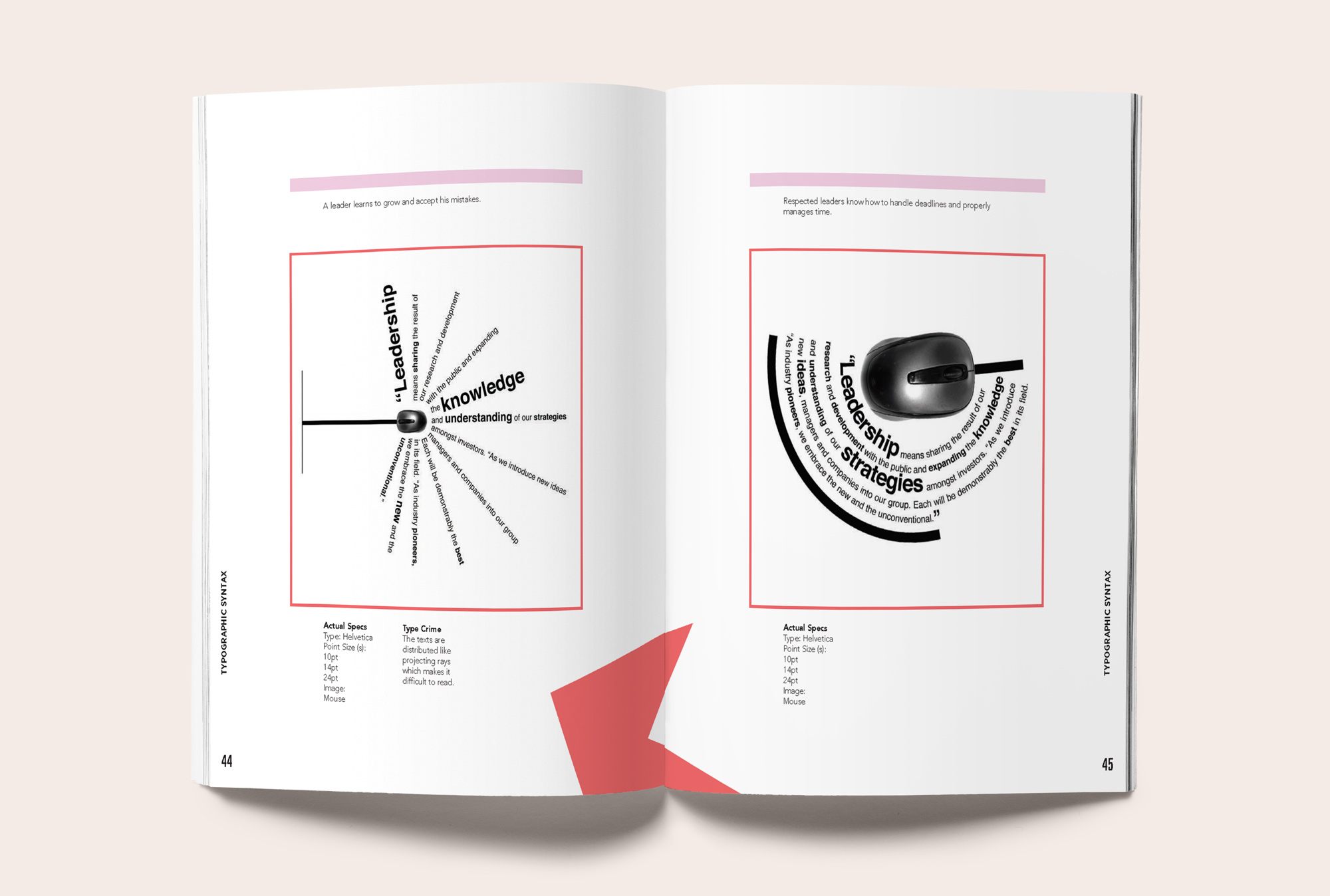
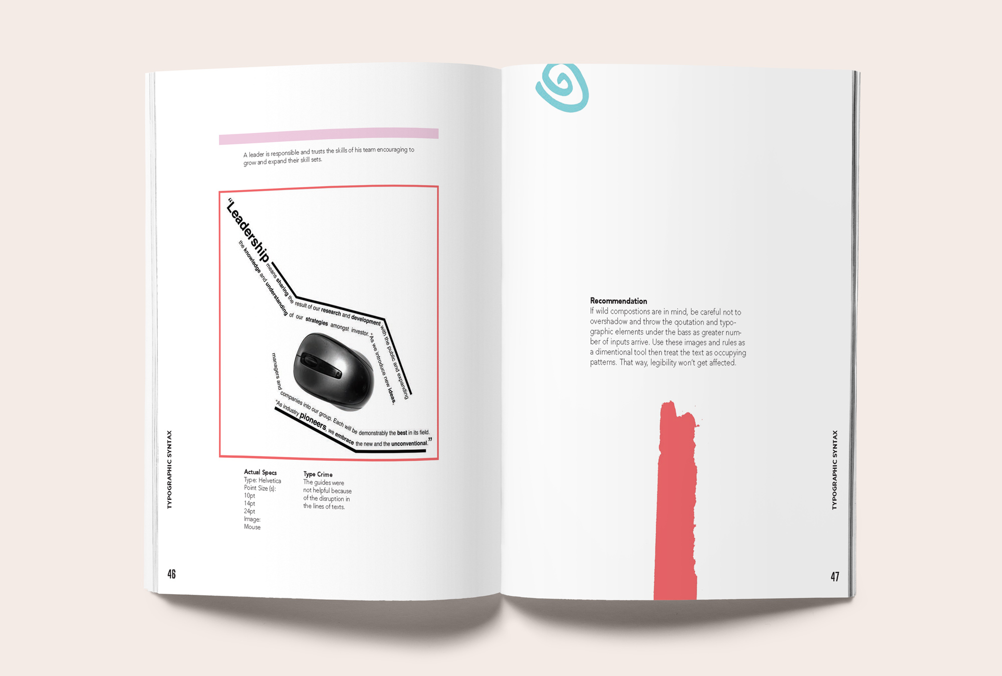
Revolve around treating typography like ingredients in a recipe, where letters and typefaces are layered and experimented with to create texture and rhythm. Visuals employ bold geometric shapes, playful color contrasts, and abstract patterns as structural motifs. Expressive layouts balance hierarchy with spontaneity, while a vibrant palette adds energy and mood like seasoning to a dish.